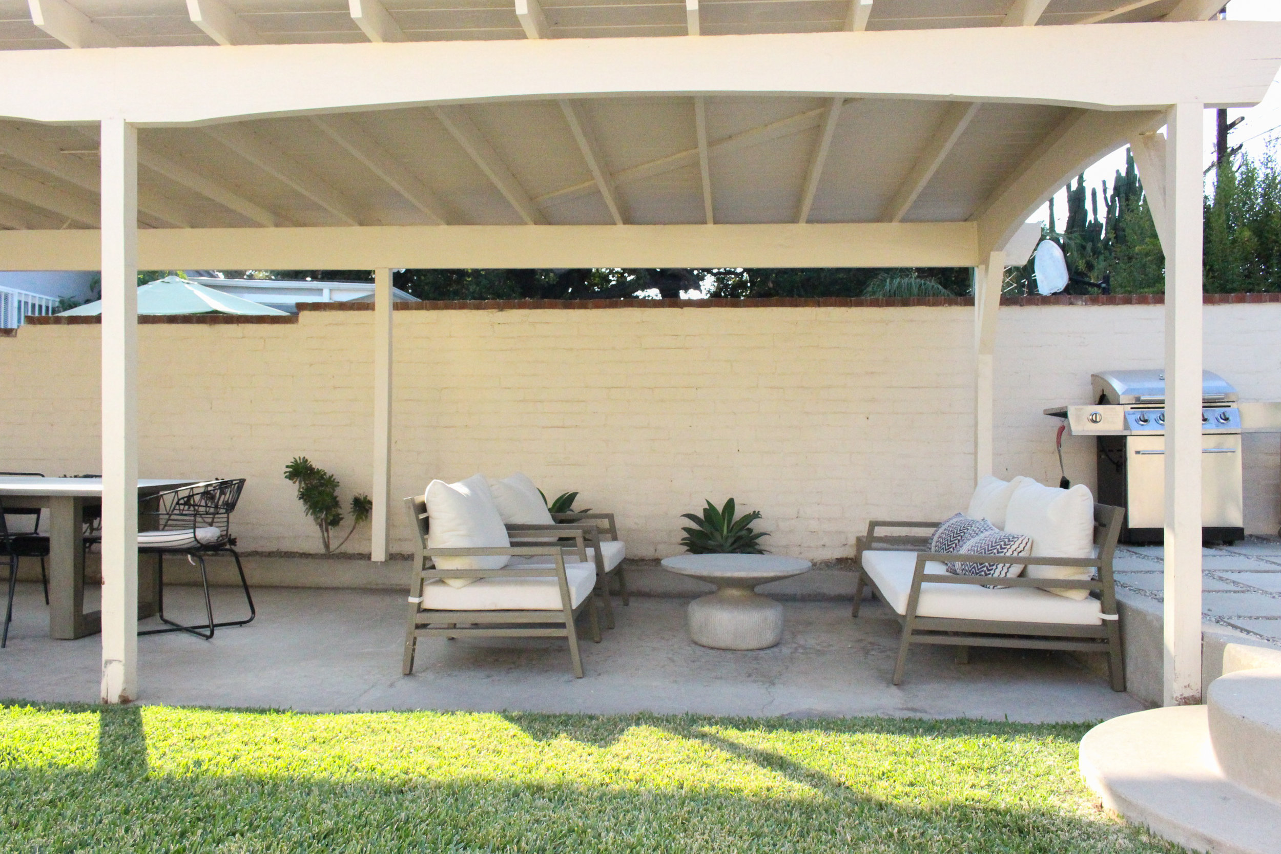
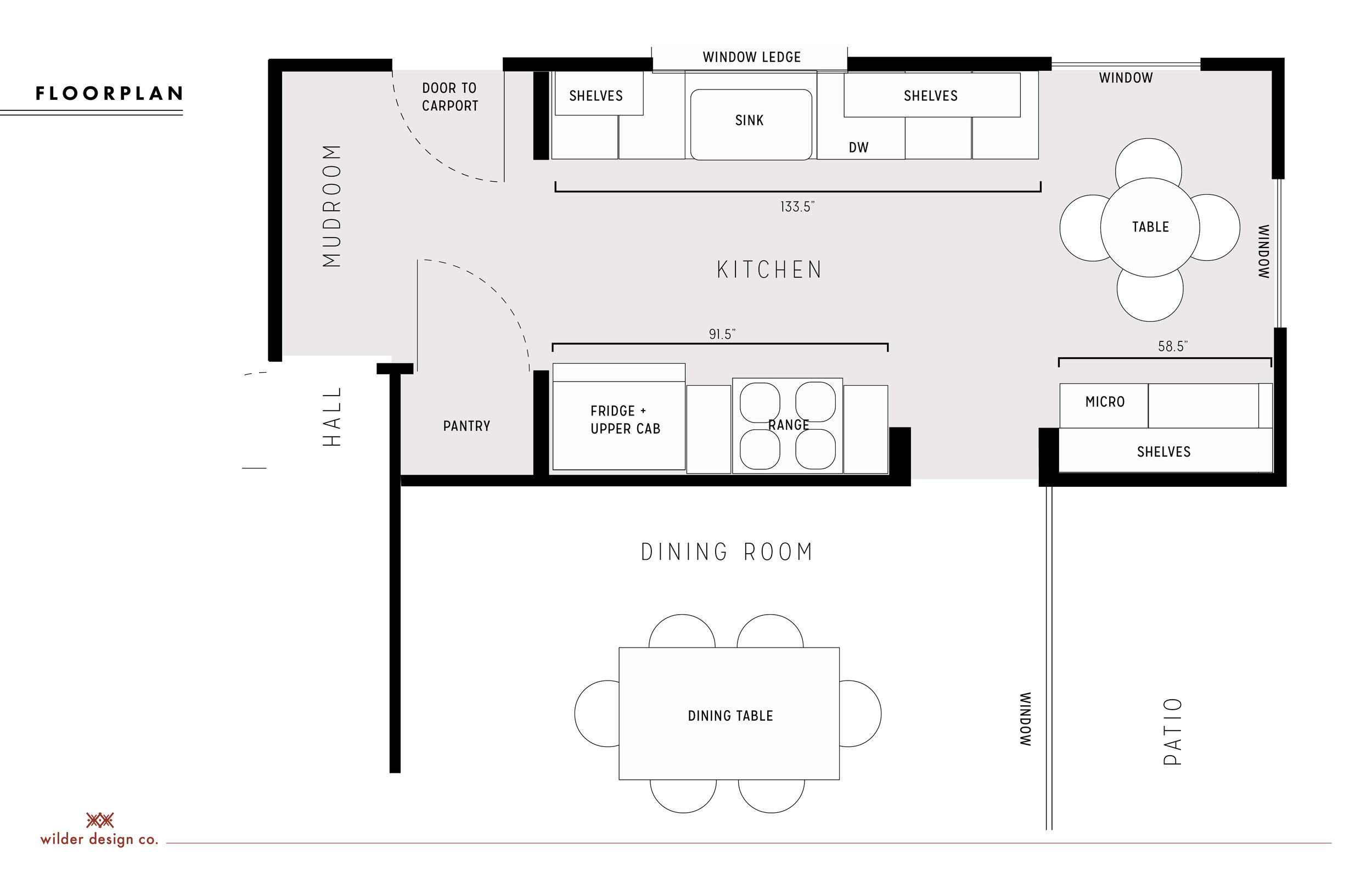
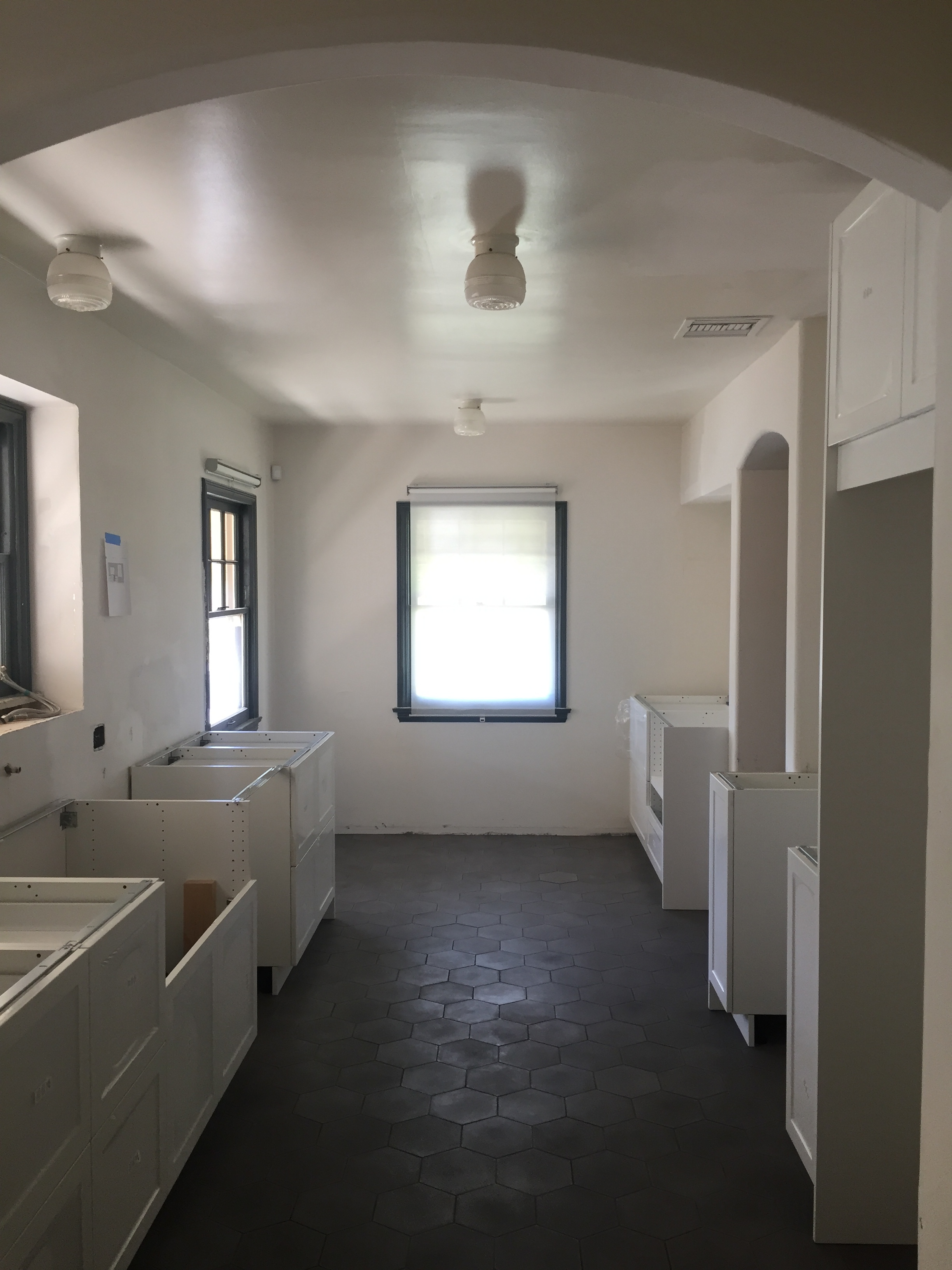
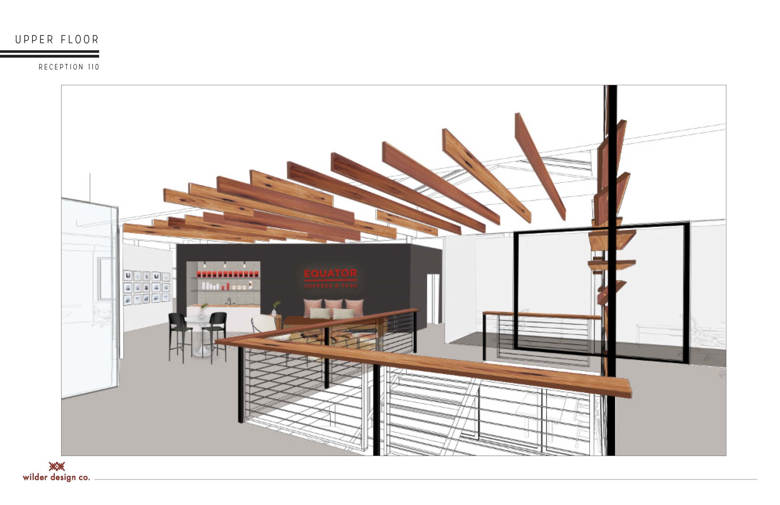
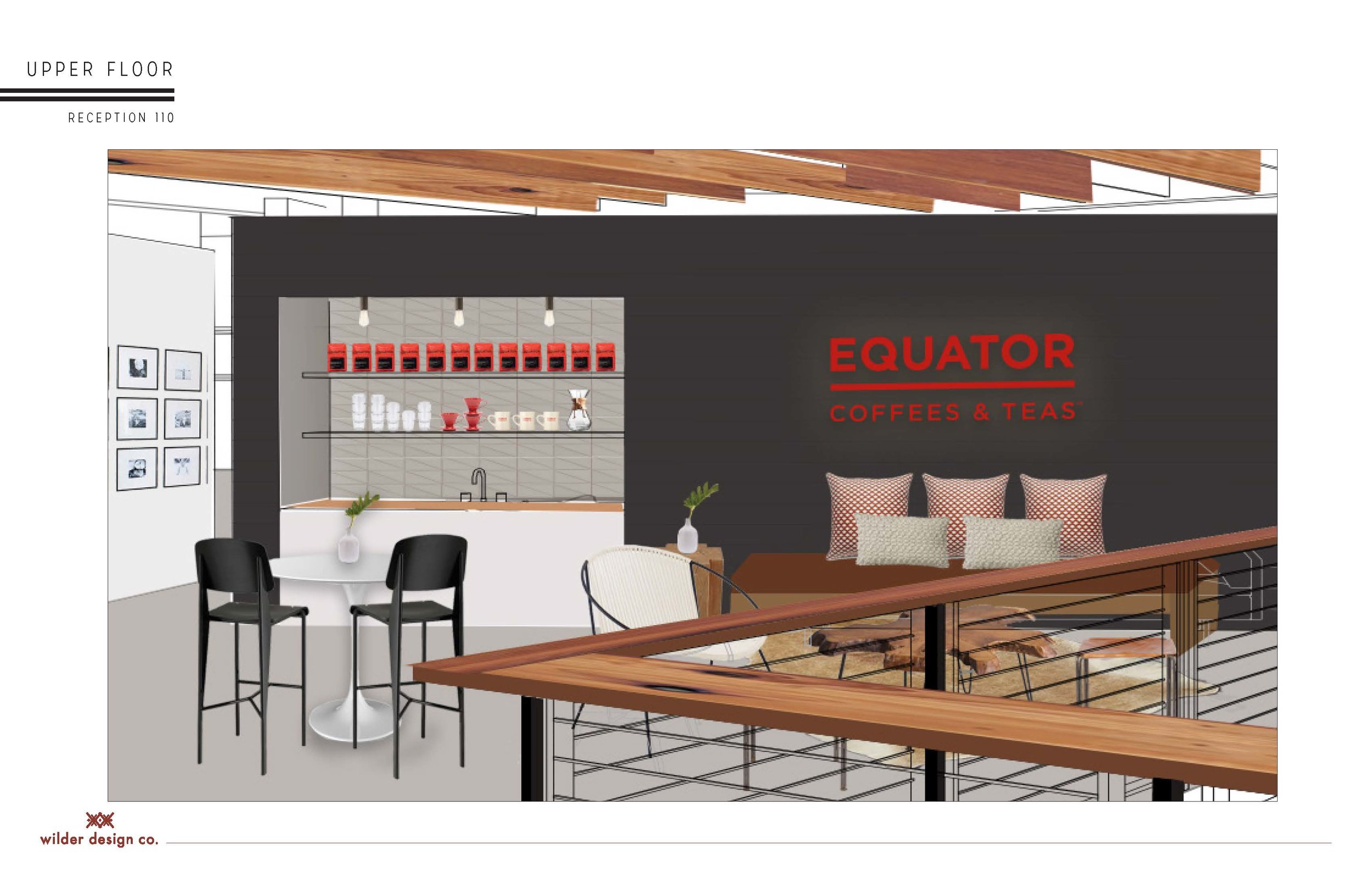
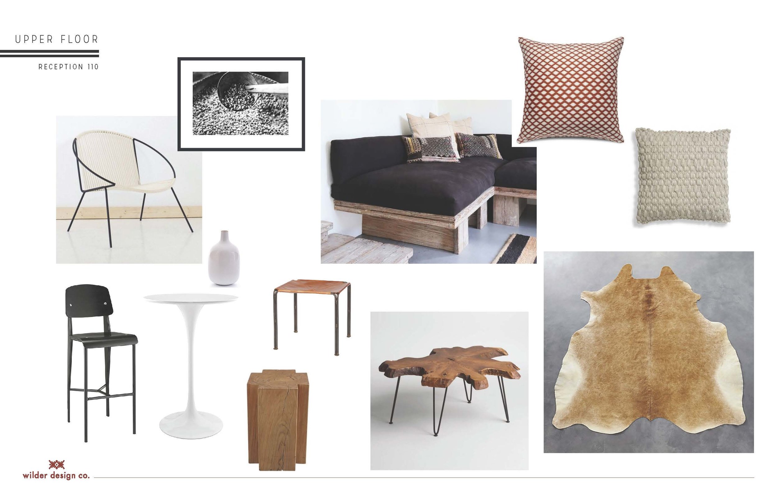
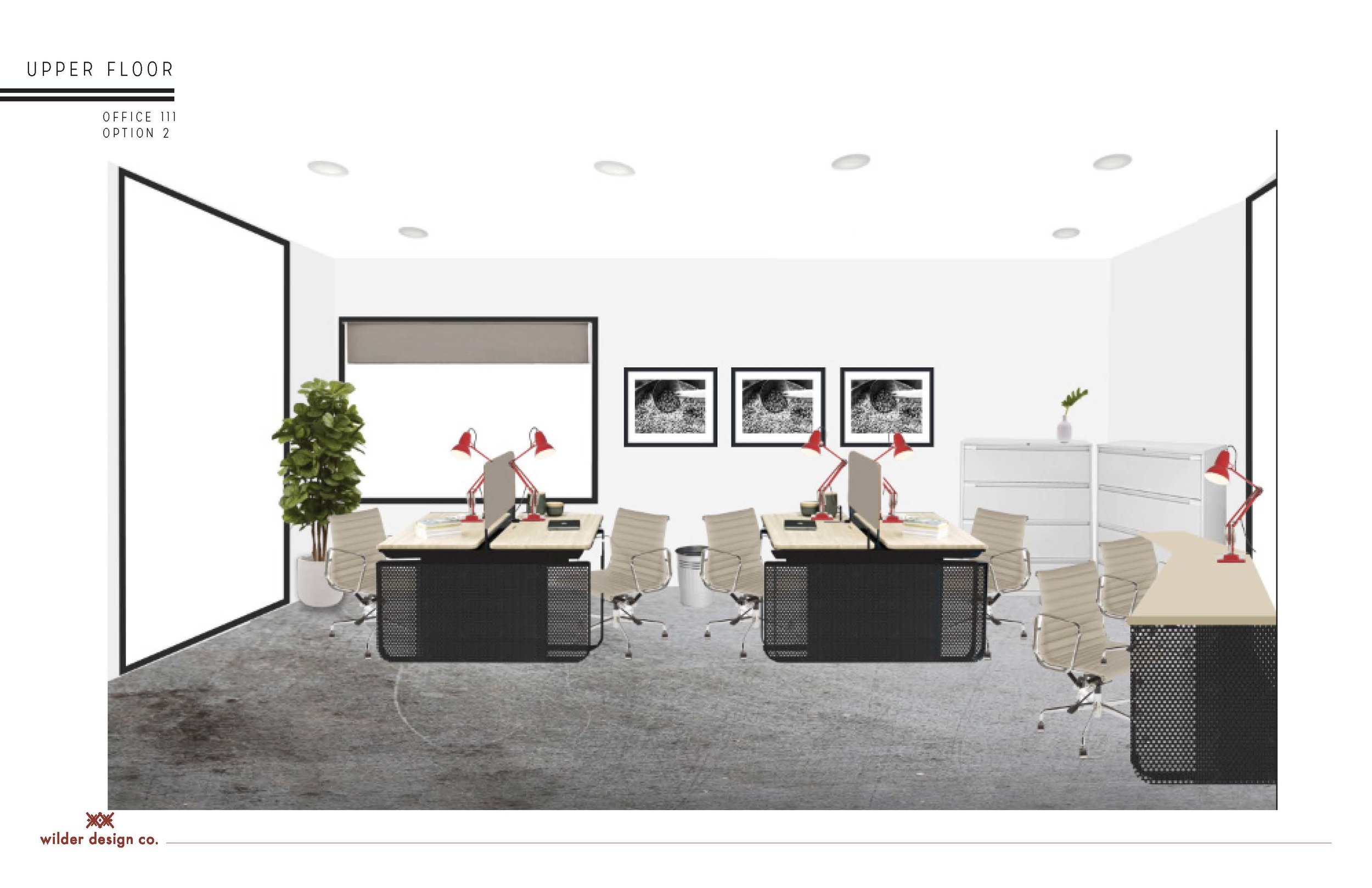
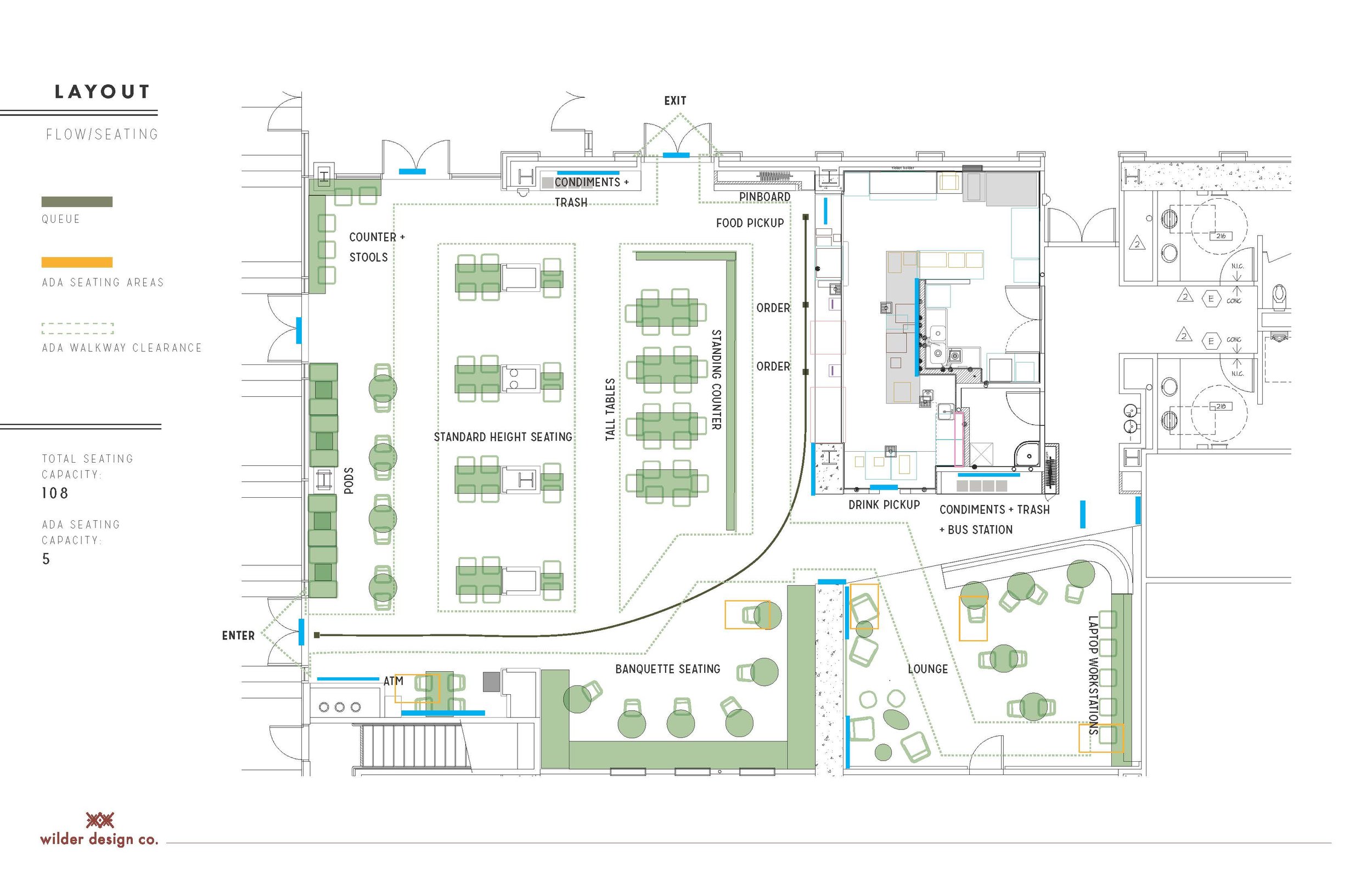
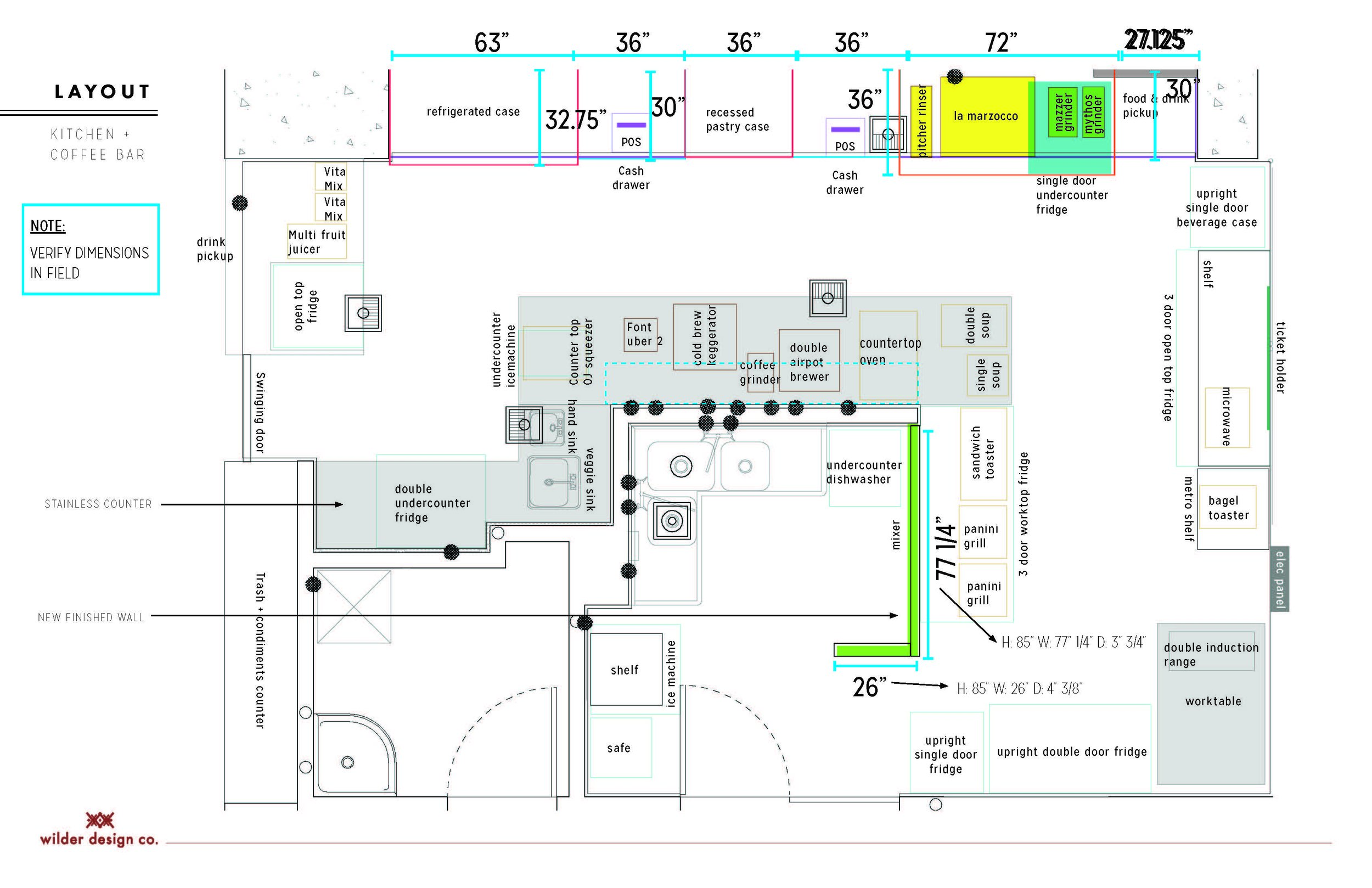
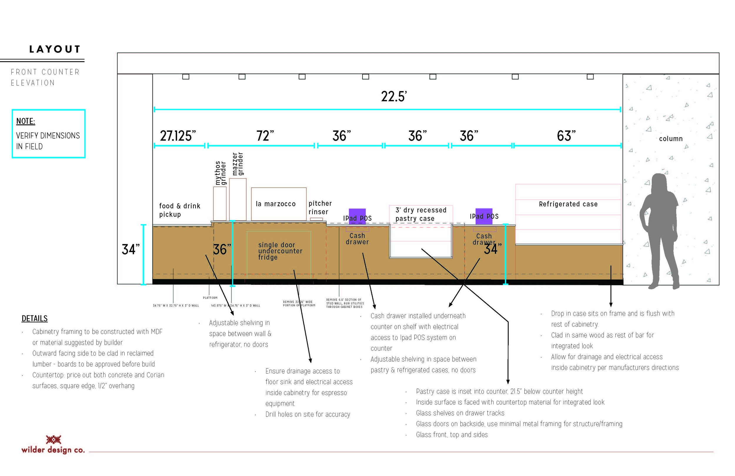
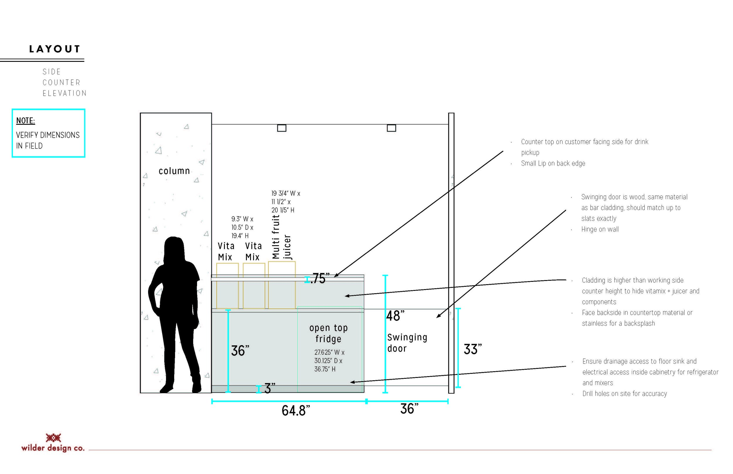
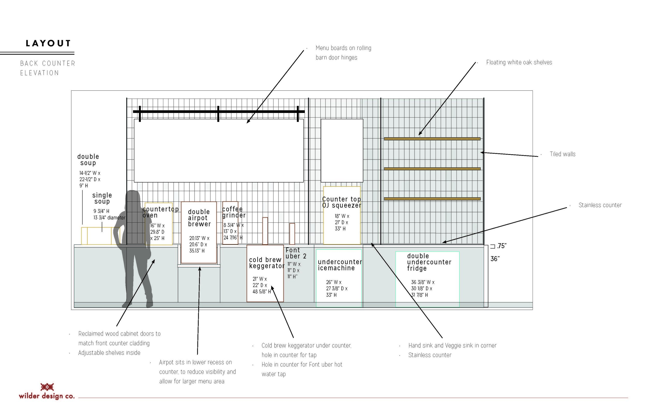
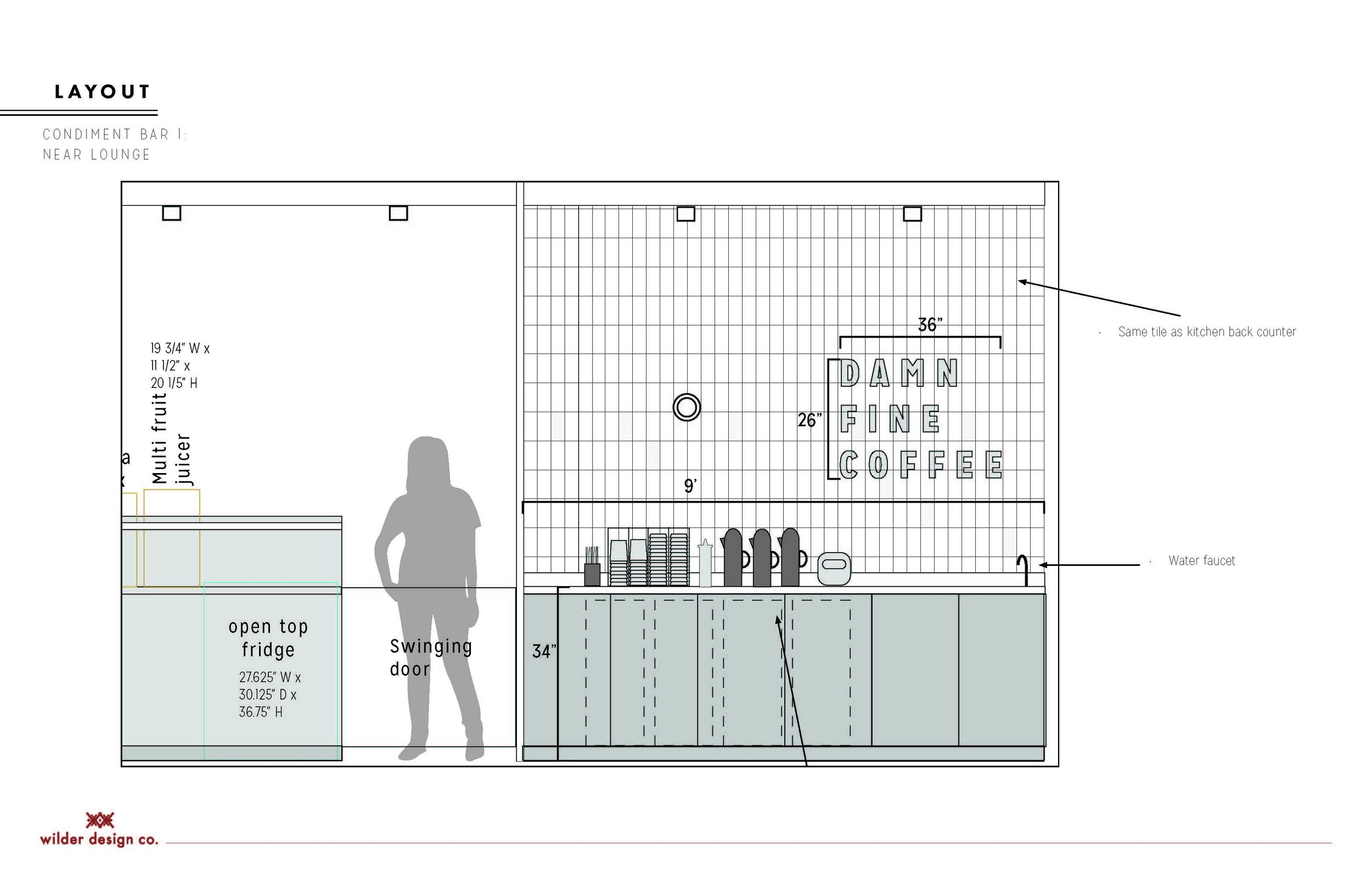
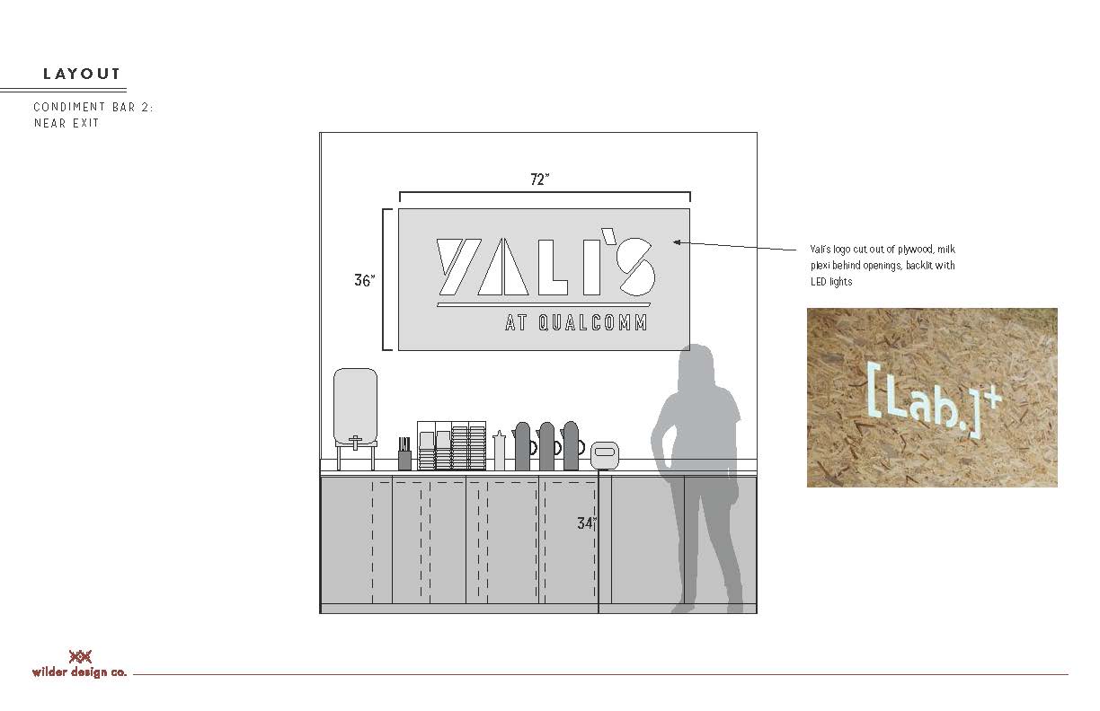
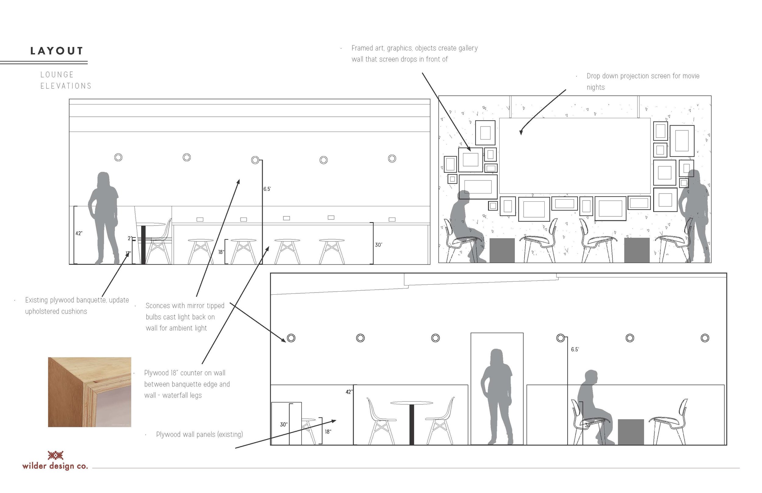
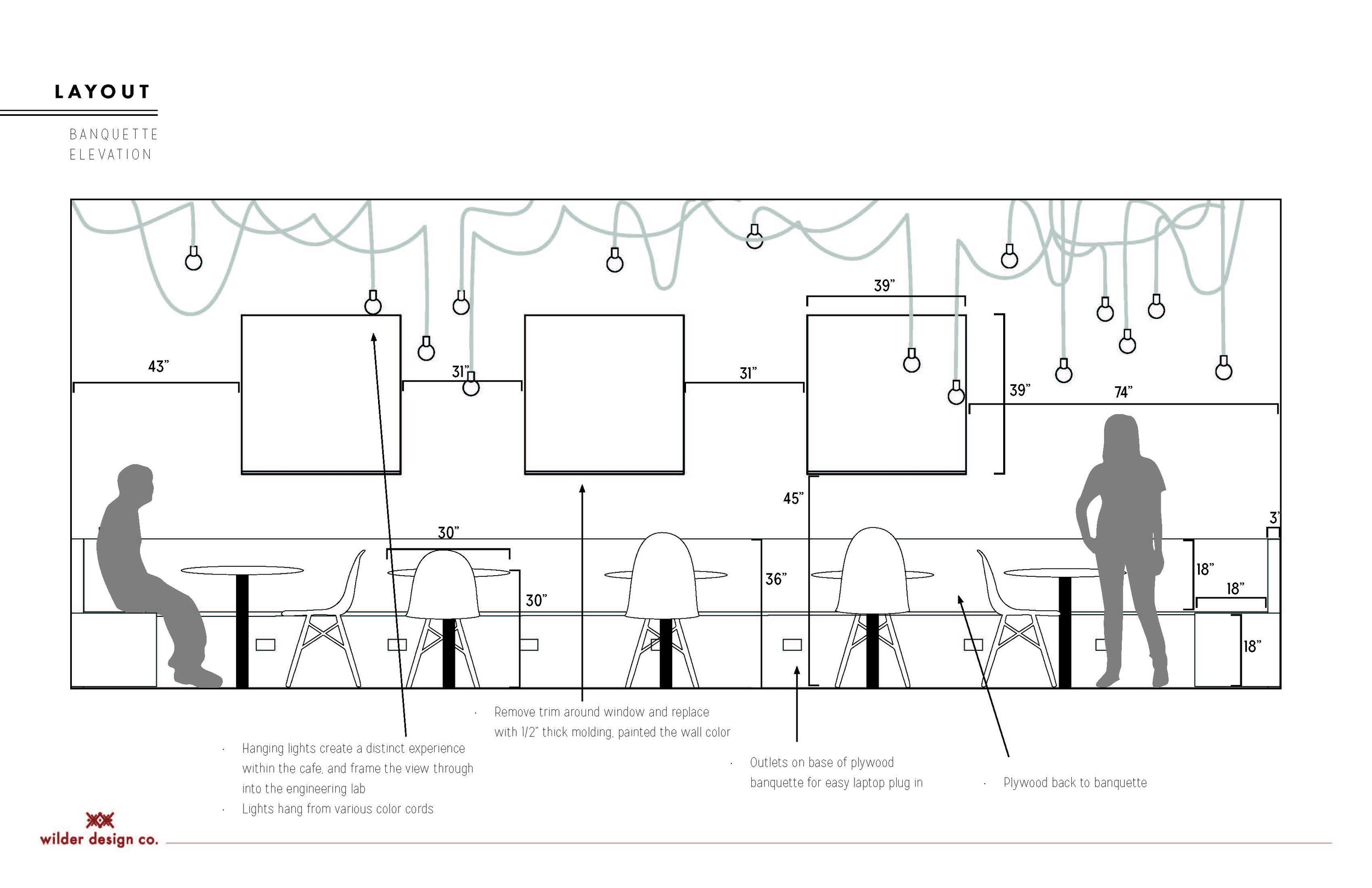
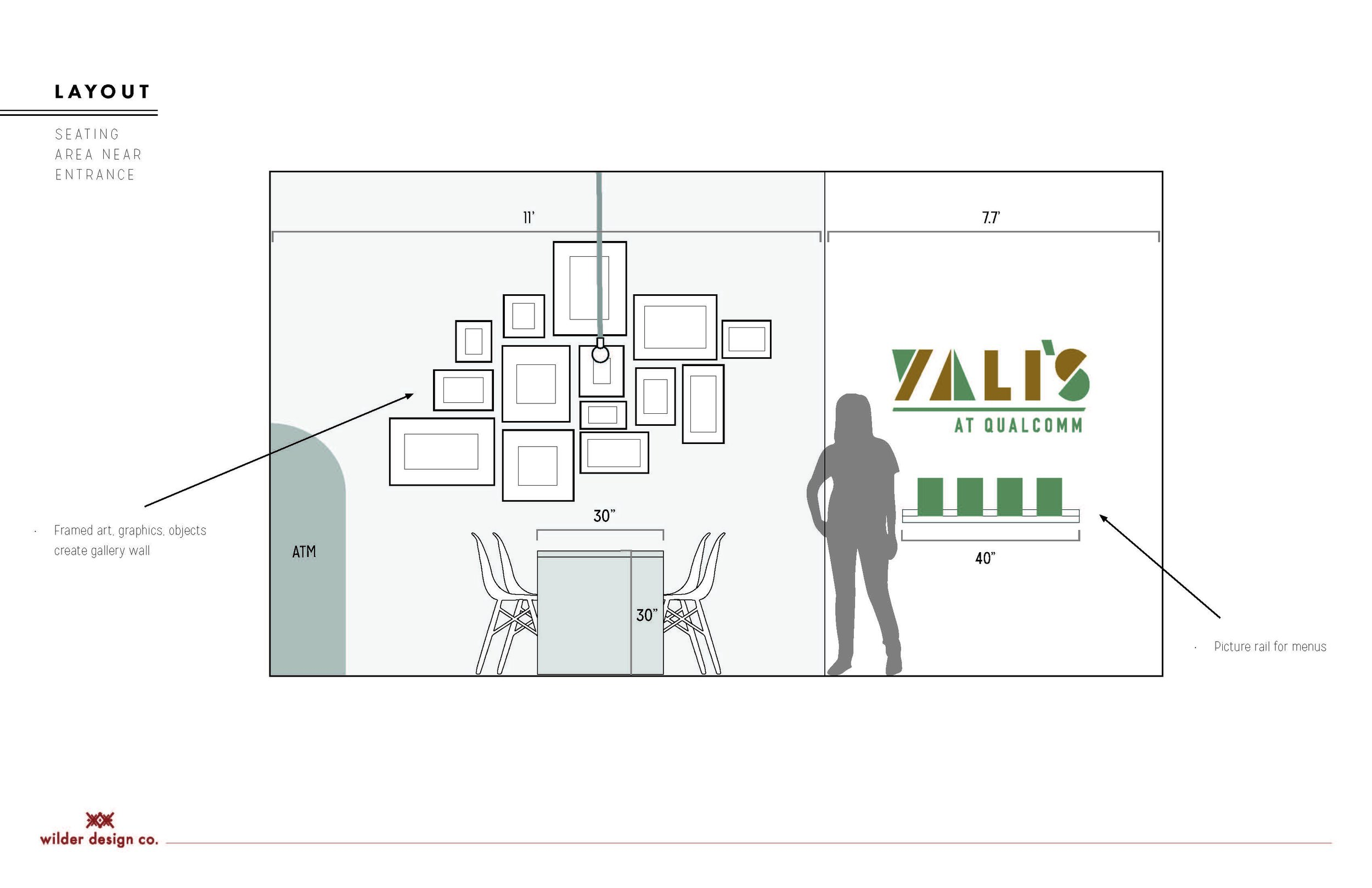
Hey guys, Jojo here! Happy to finally have time to share a space where you can always find me - the backyard! Last year we replaced the crumbly old volleyball court with a drought tolerant landscape and removed some ancient hedges. So this summer we took on the task of furnishing the expansive patio with a seating and dining area in addition to a cozy fire pit zone and veggie garden. We are really happy with how it turned out and have been enjoying the backyard all summer long. As with anything, its always a work in process, and in the future we have big plans of re-painting our homes exterior, updating/adding lighting, painting a mural on the garage wall and maybe throwing in a little pool. Hey - we can dream right? In the meantime I am loving our new garden, its sort of my favorite place. Enjoy the pics and if you’re in the hood stop by for some tomatoes, they are so so good. (Unless Arlo eats them all) K bye! xo, Jojo
Harrison Hacienda Kitchen Reveal
Well its certainly been a while since I’ve posted about the Harrison Hacienda Kitchen - the last time was in 2016 when we first moved in! Quite a lot has happened since then: we renovated the backyard, the playroom, did some tweaks here and there to our bedrooms (which I’ll post about separately) but the largest project we’ve taken on so far is our kitchen. Here are some before pictures to jog your memory.
Before:
This kitchen had seen a lot of action over the years and was in dire need of a make over. We knew this would require a lot of planning and soul searching so we spent the last 2 years doing just that. After going in various directions with the design we landed on our concept: Modern Spanish Deco. The goal for the whole house is to of course maintain and amplify its romantic spanish bones, but modernize it by keeping things minimal. We also wanted to add some graphic punch which draws from the deco influences in the home as well as the era in which it was built. Here was the game plan.
Design Plan:
Layout:
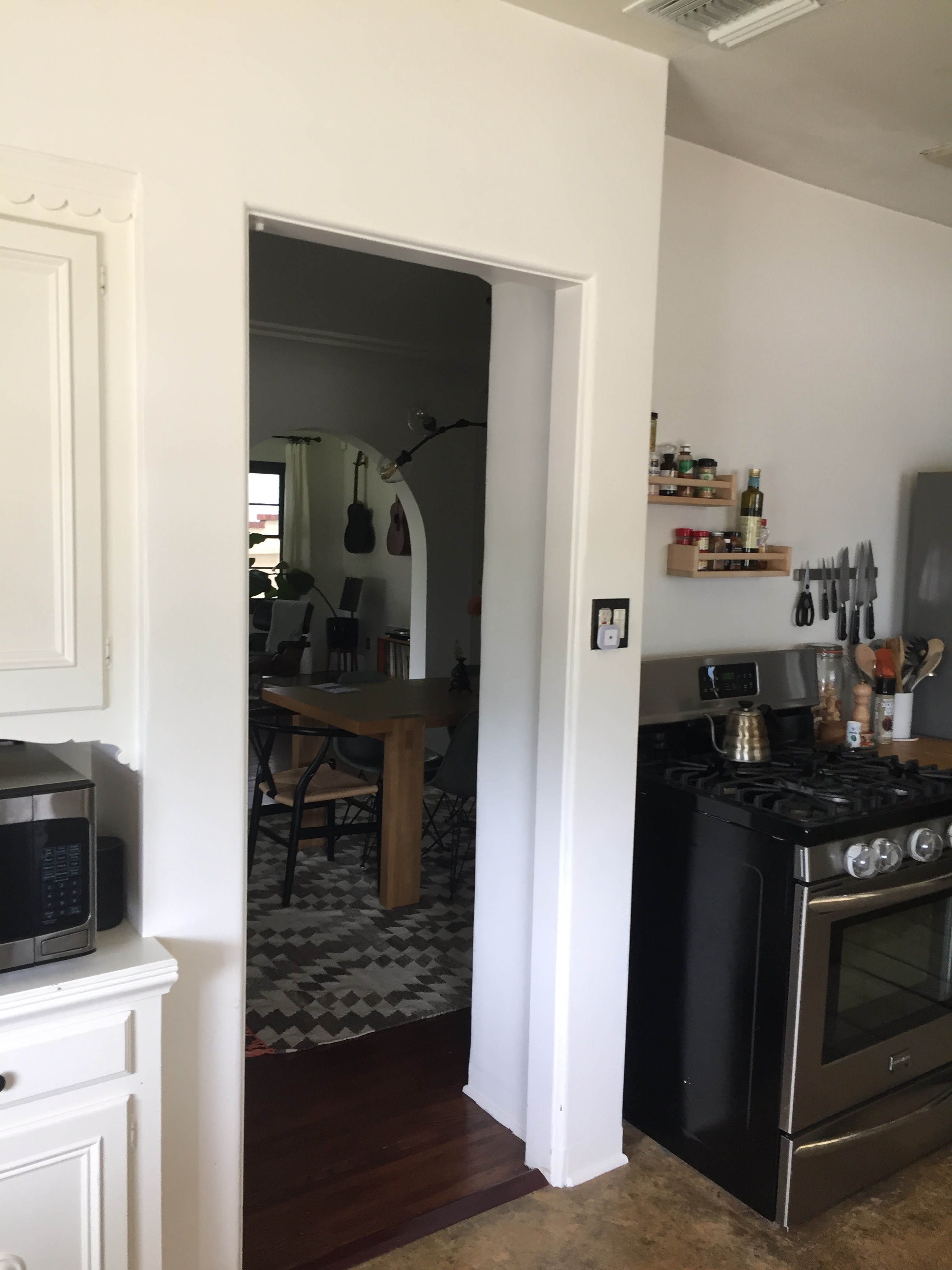
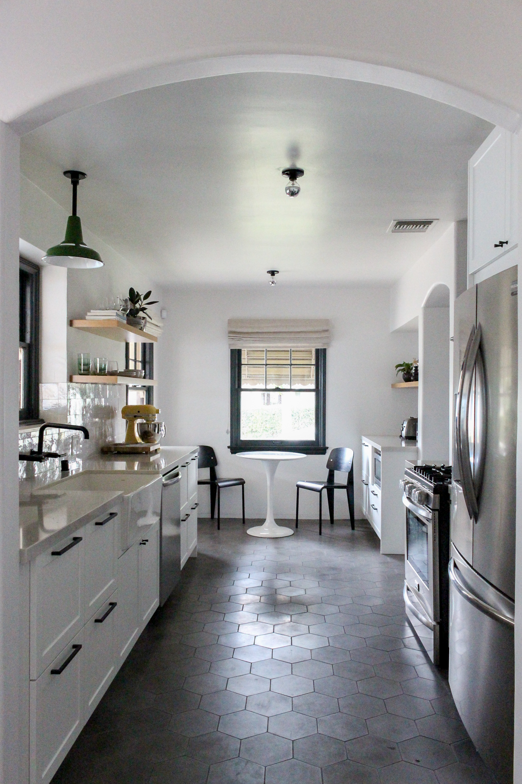
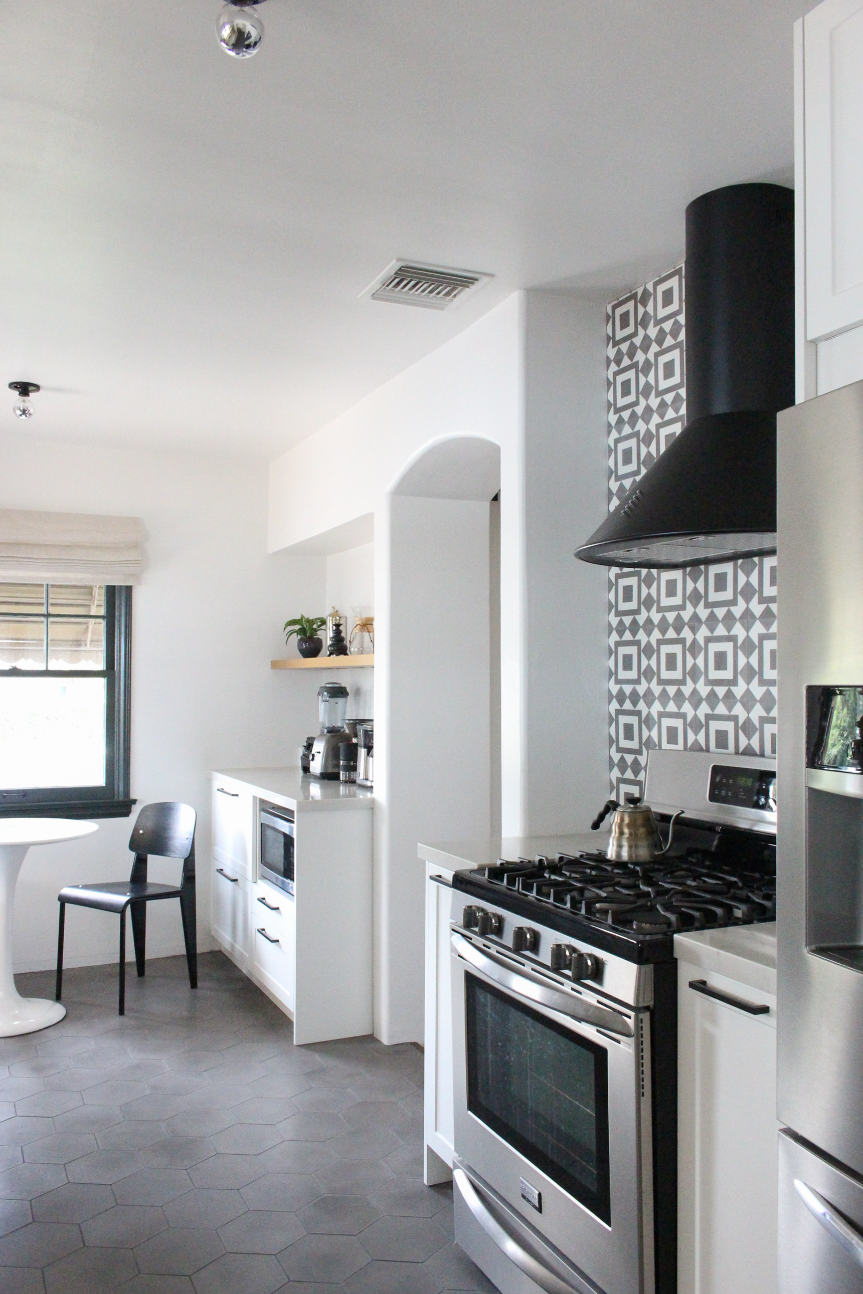
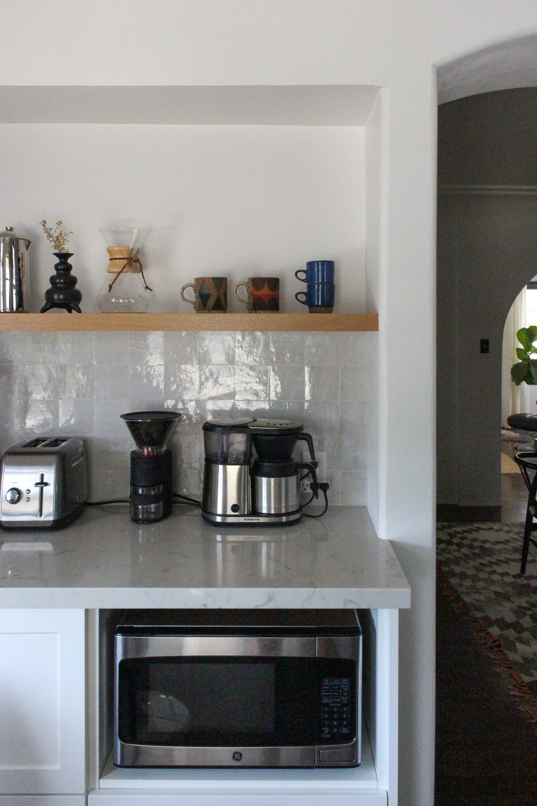
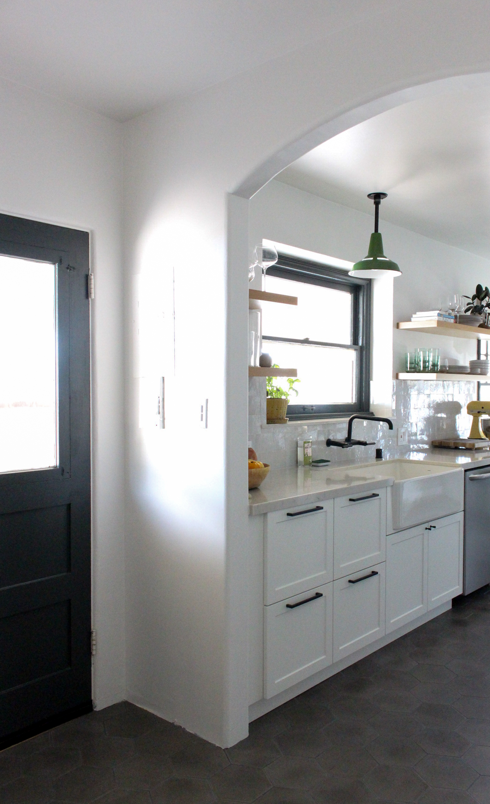
You may have noticed that we left the wall between the dining and kitchen intact. This was done mainly for budget reasons, but also made a lot more sense when it came to the dining room side of the wall. Keeping the wall preserves the integrity of the original kitchen which kept the space separate and special, not to mention giving us space to put a graphic backsplash! We did need more room to make the kitchen more functional, so instead of going for open concept, we decided to widen the existing entries into the kitchen to make it feel wider, as well as forgo upper cabinets to lighten things up.
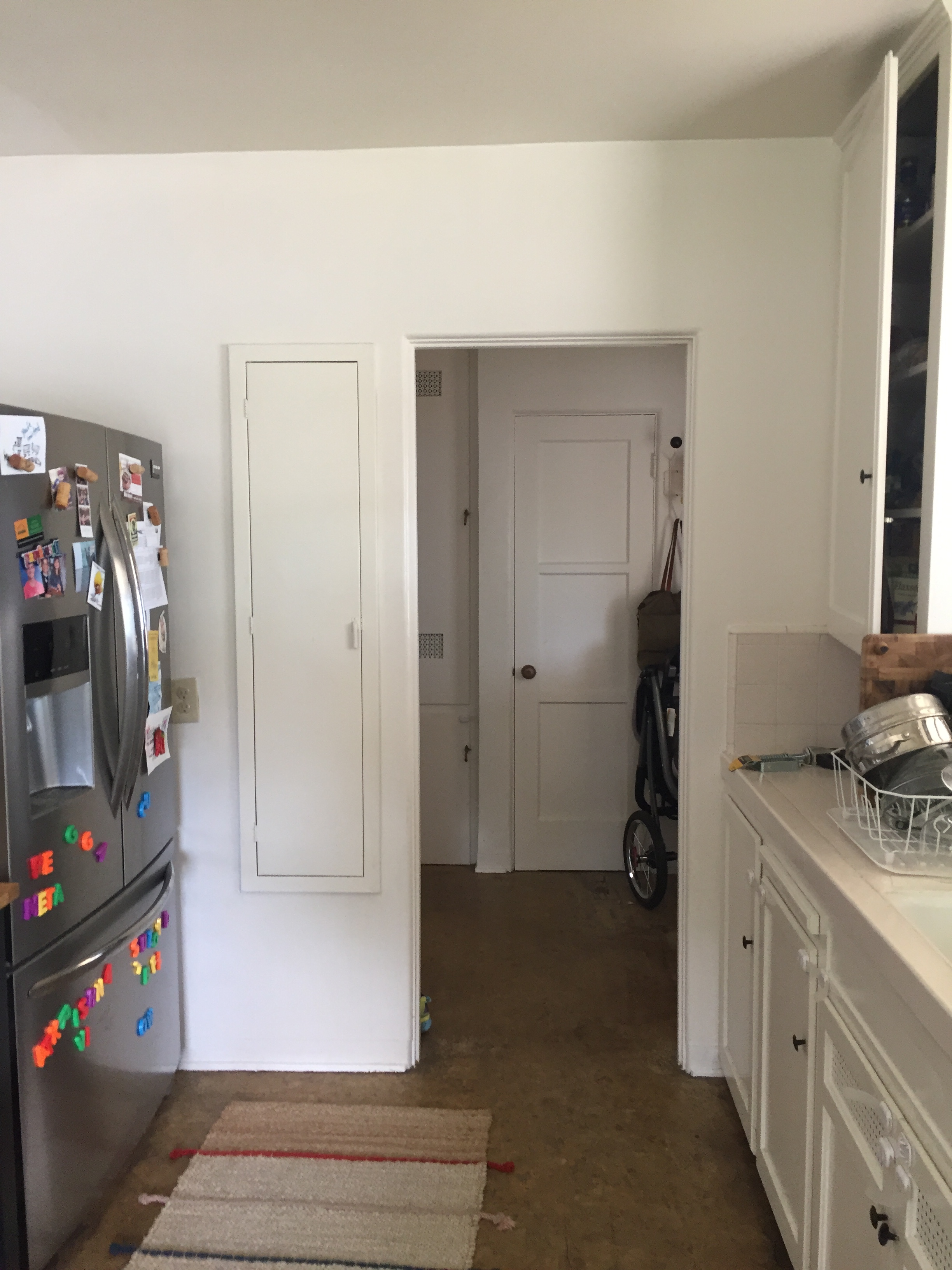
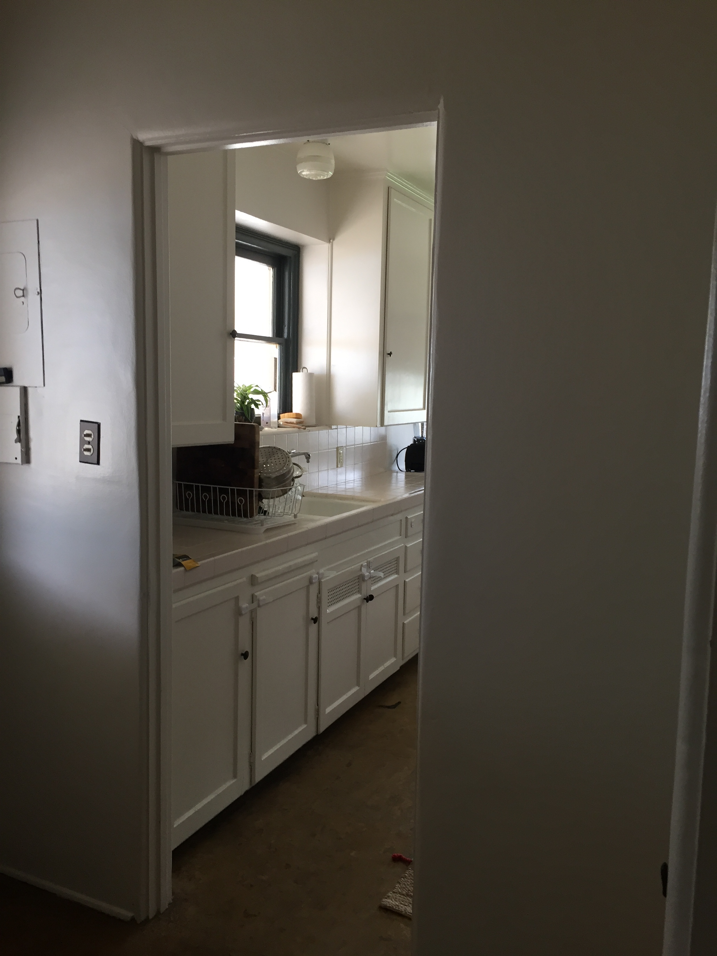
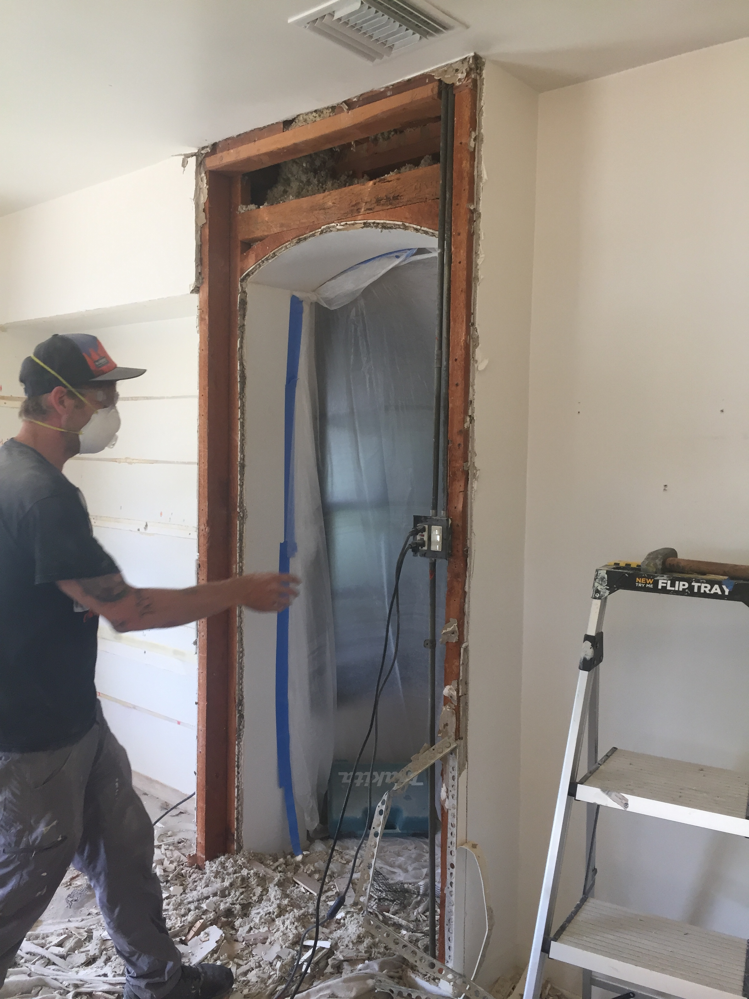
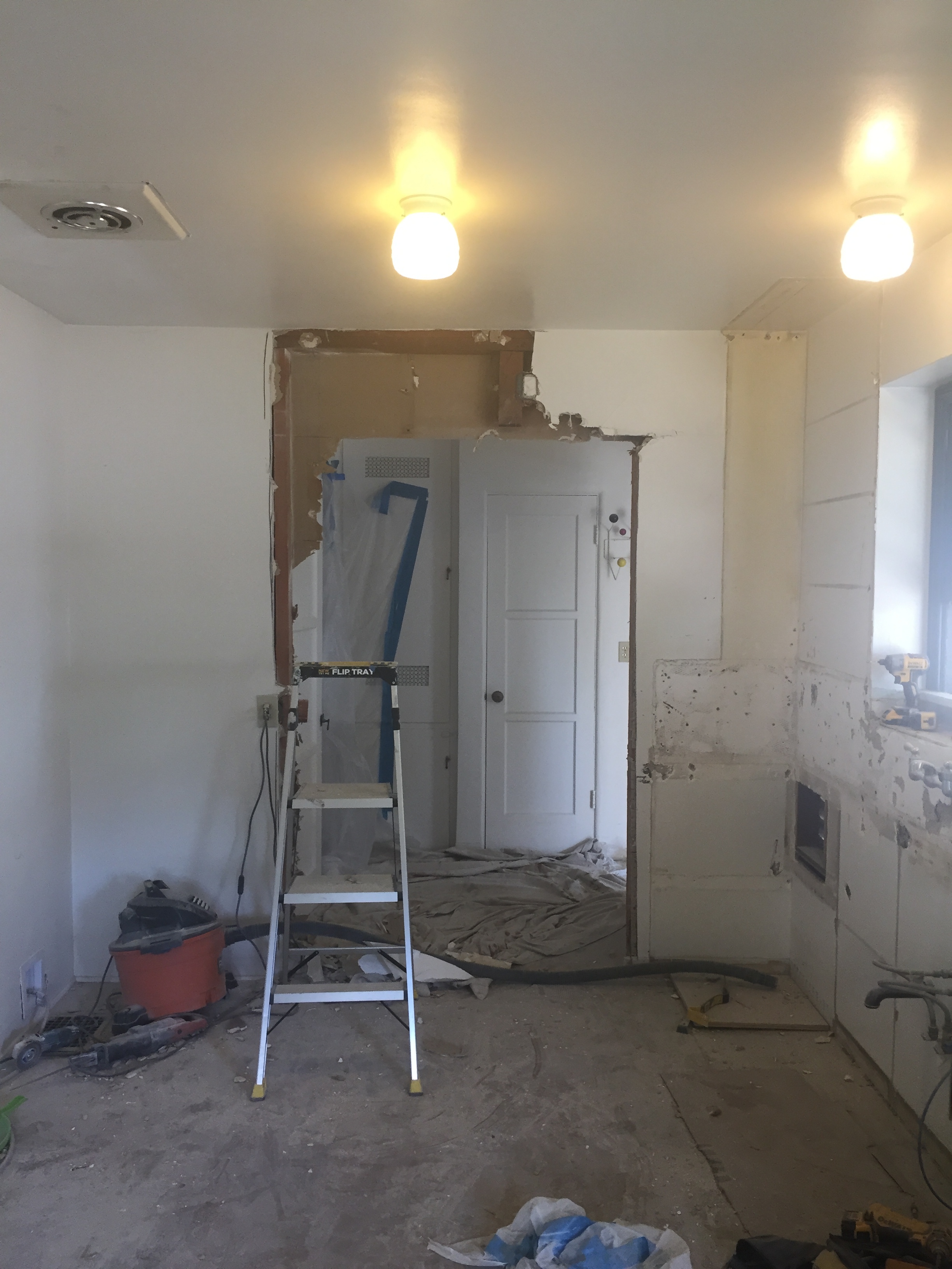
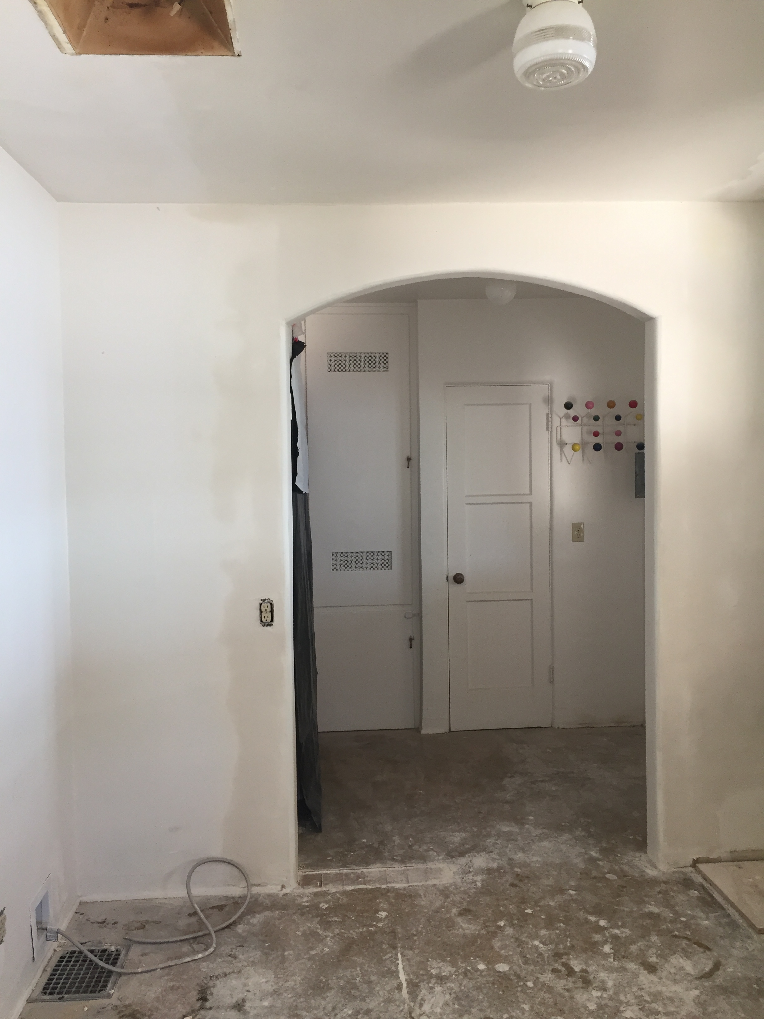
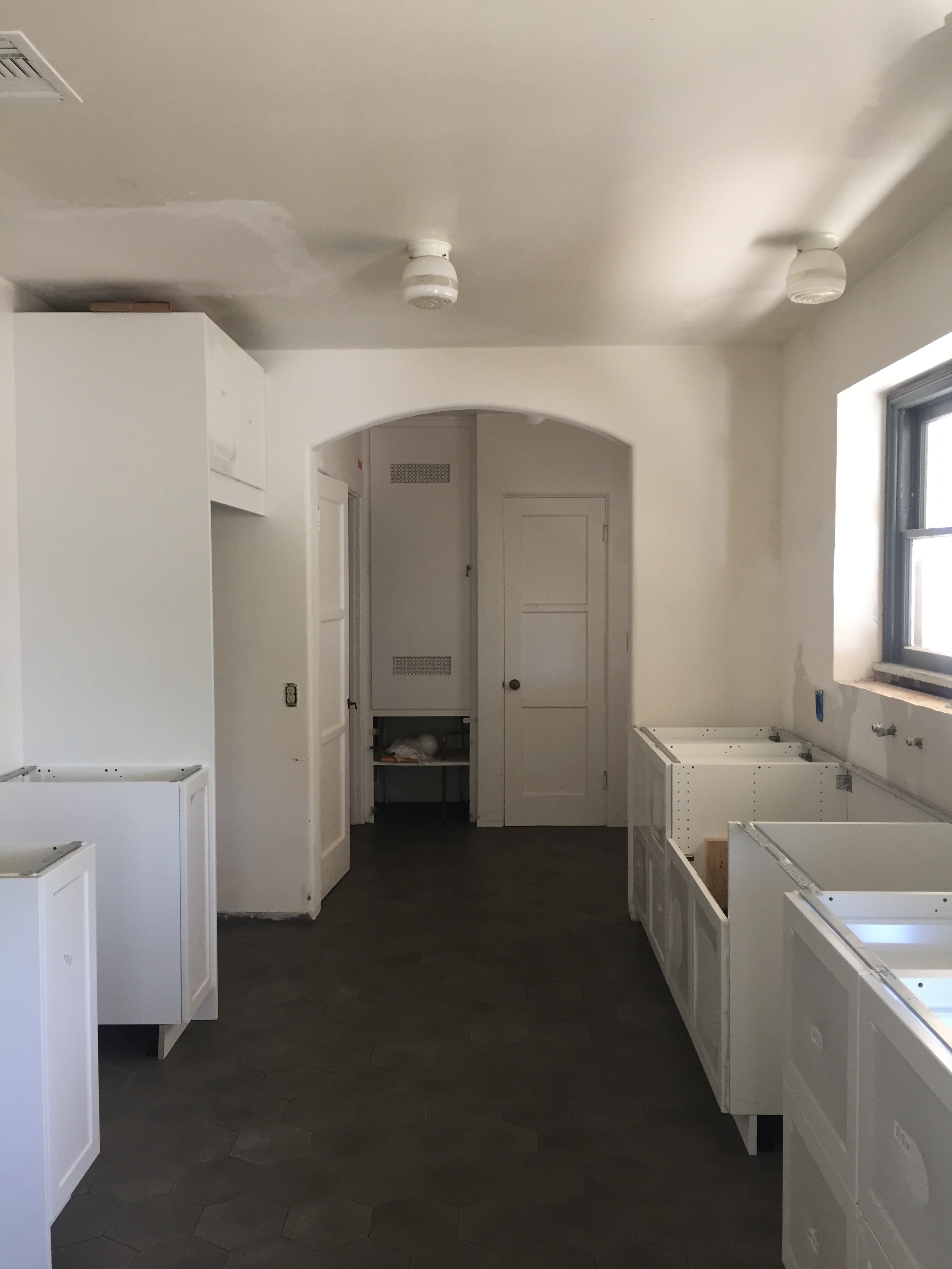
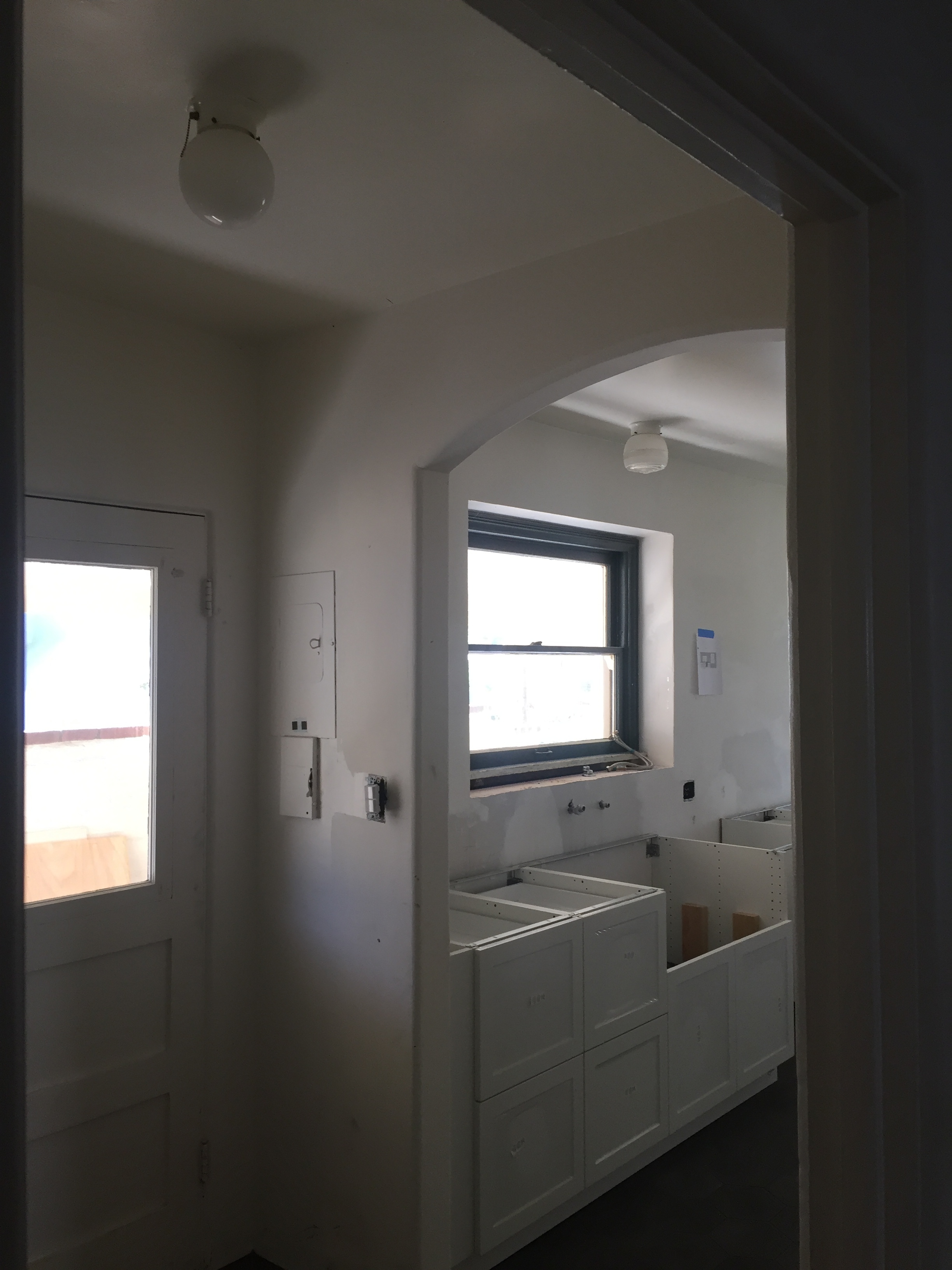
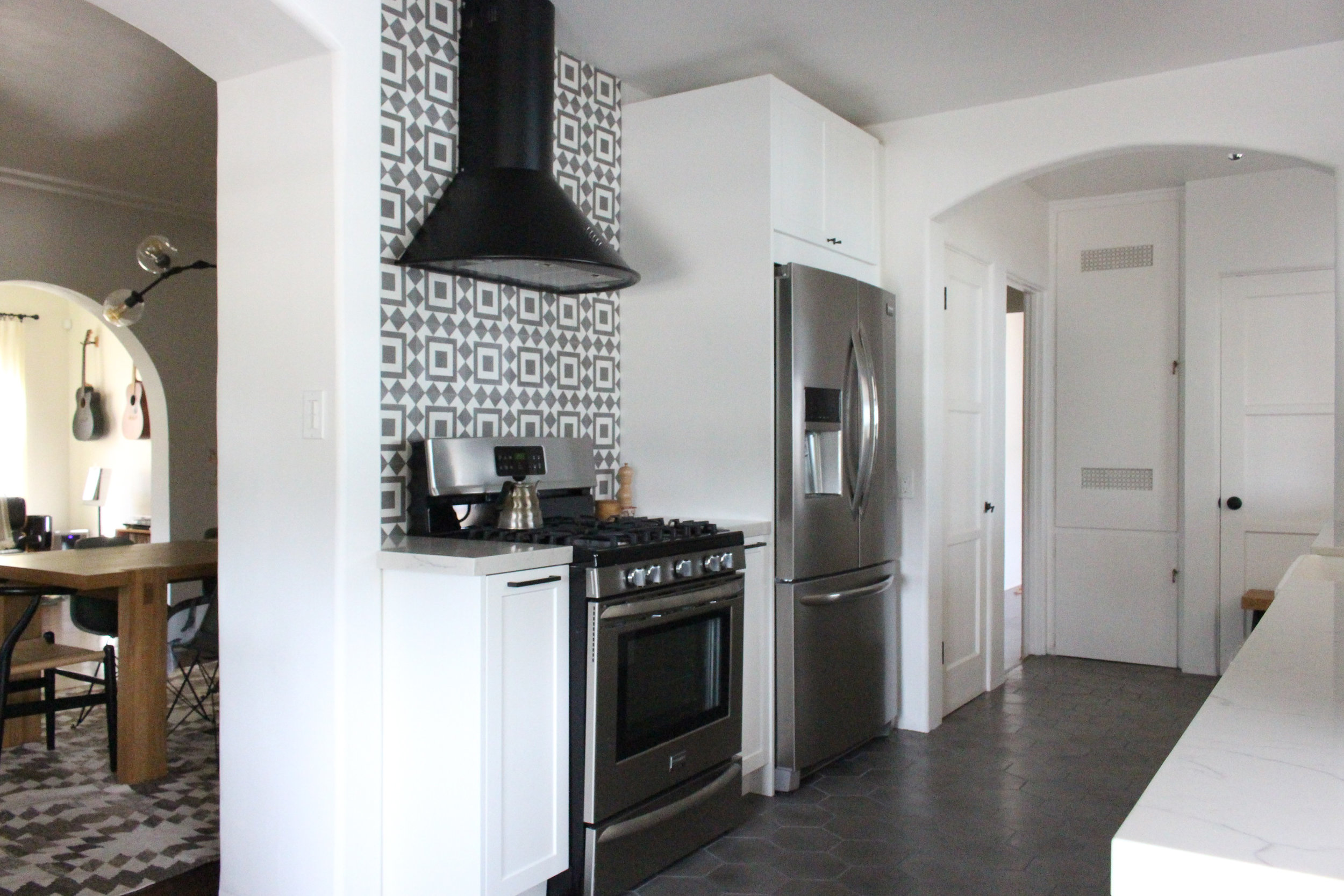
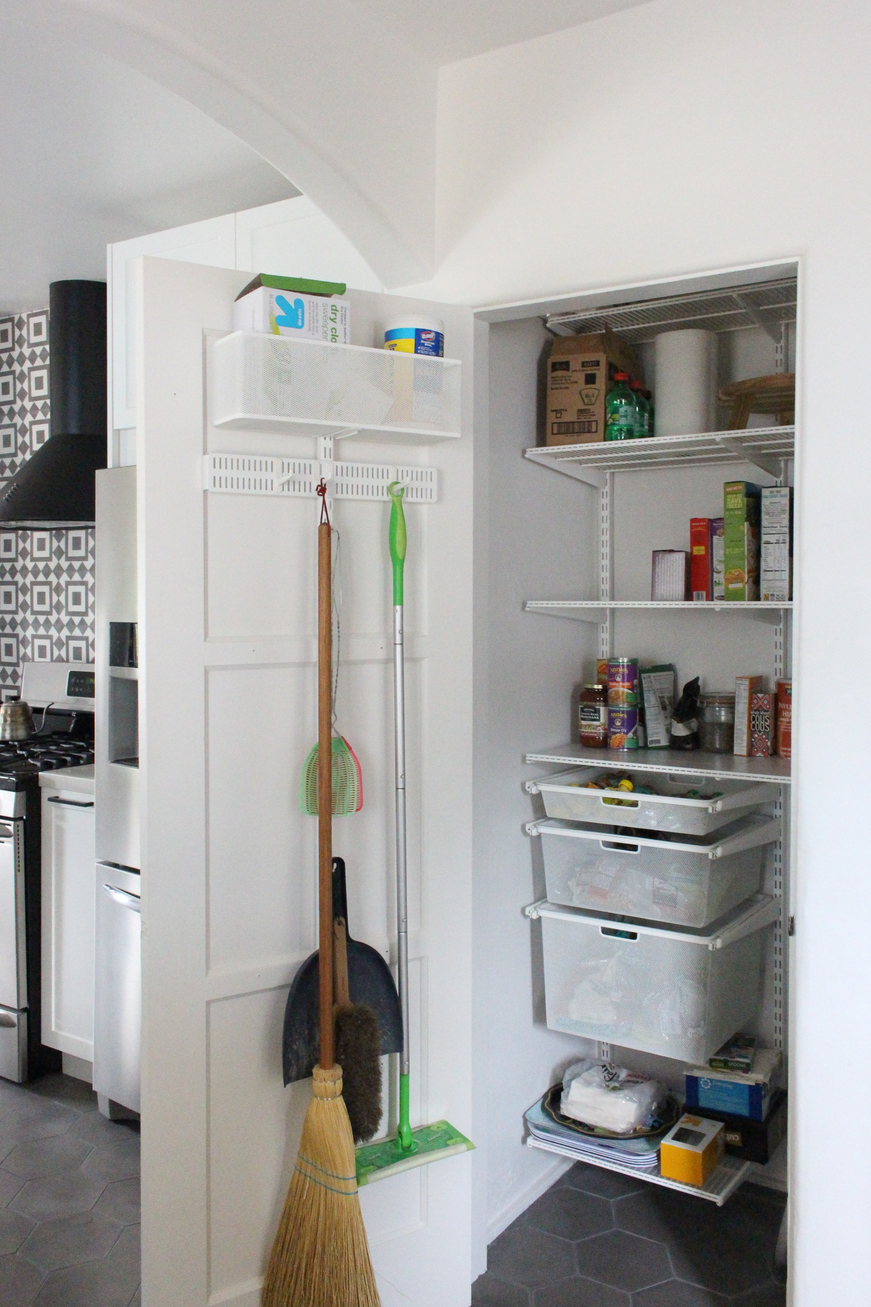
But the mudroom was always a head scratcher for us, it was too small to function on its own, and seemed to chop up the flow when entering from the hall or carport. So we decided to remove a portion of the wall that had a fold out ironing board in it and make the entrance into one large arch to connect with the arched entrance from the dining room. This allowed us to convert the broom closet into a pantry, which made much more sense functionally, especially since we were removing the upper cabinets.
Cabinets:
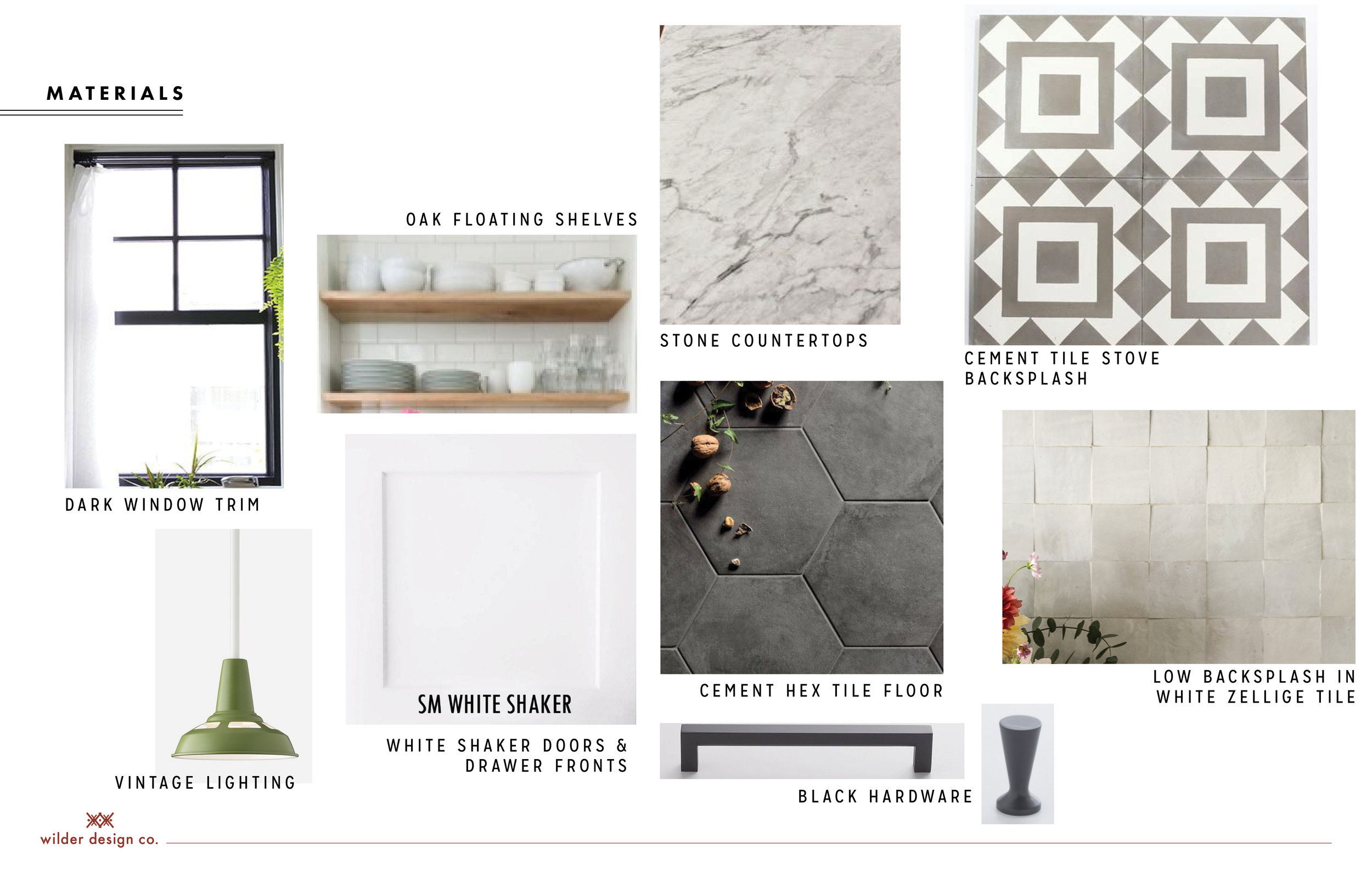
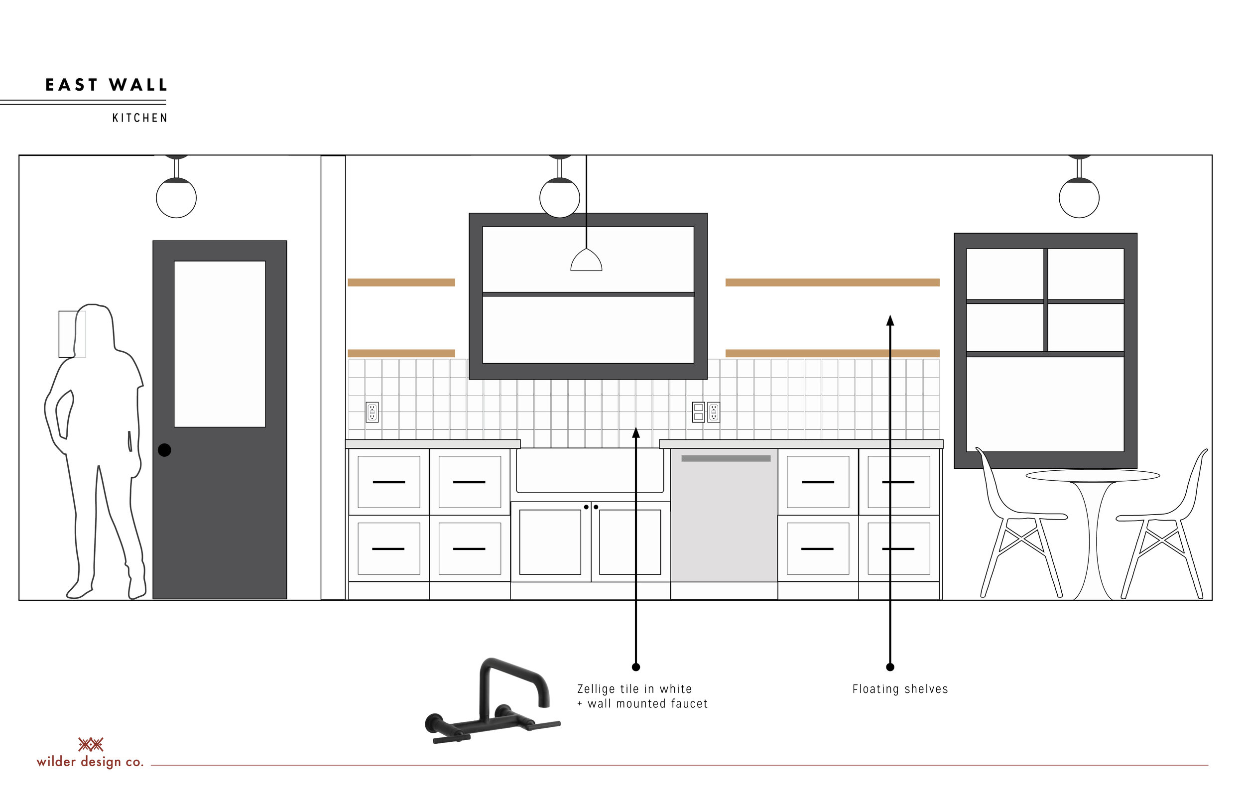
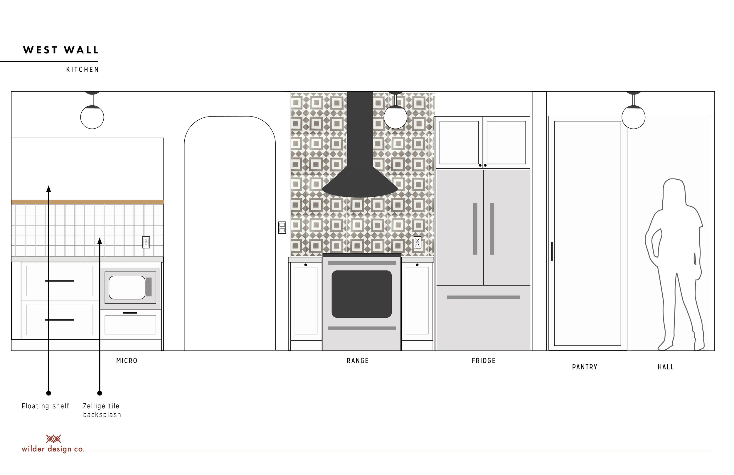
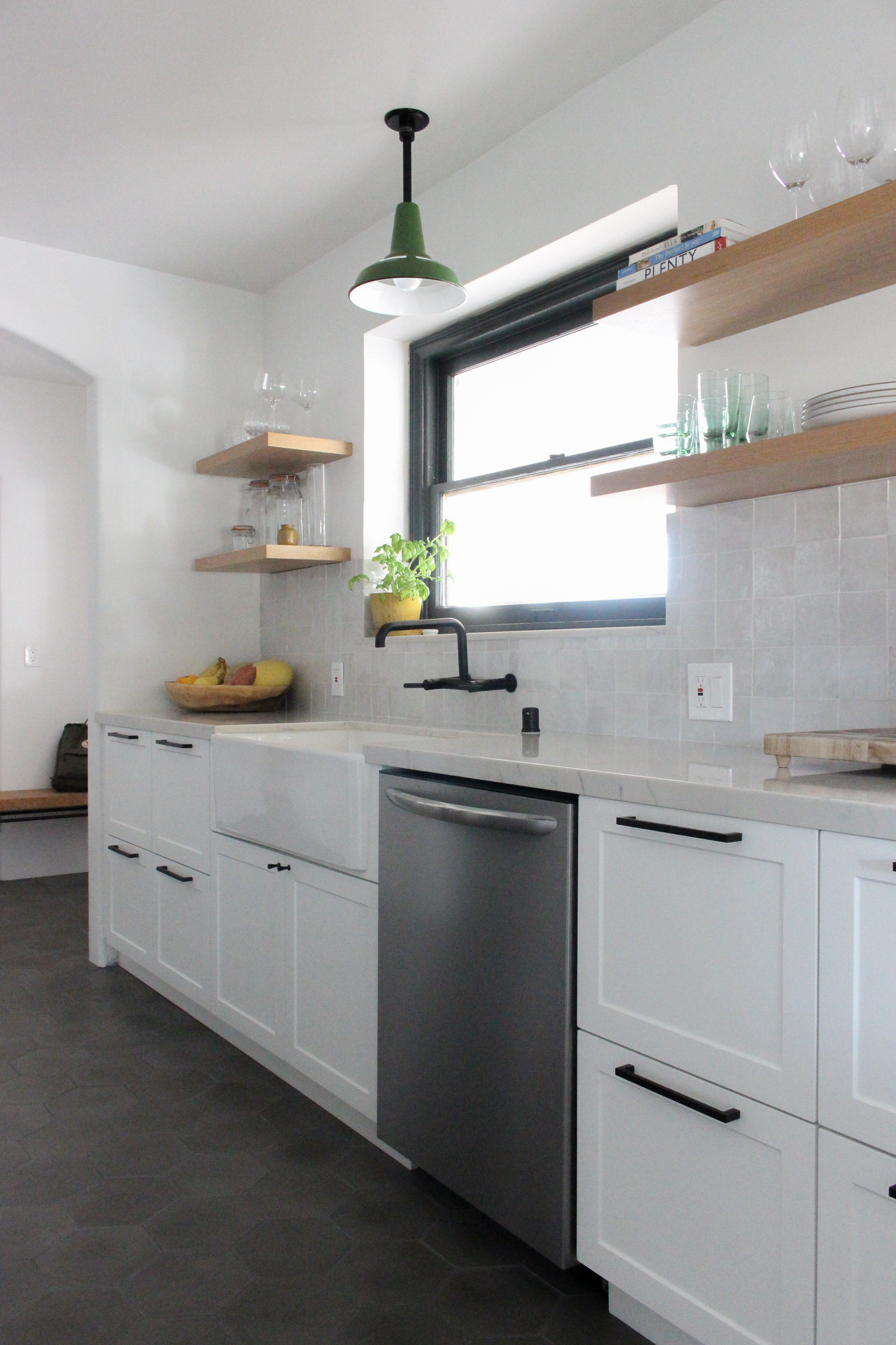
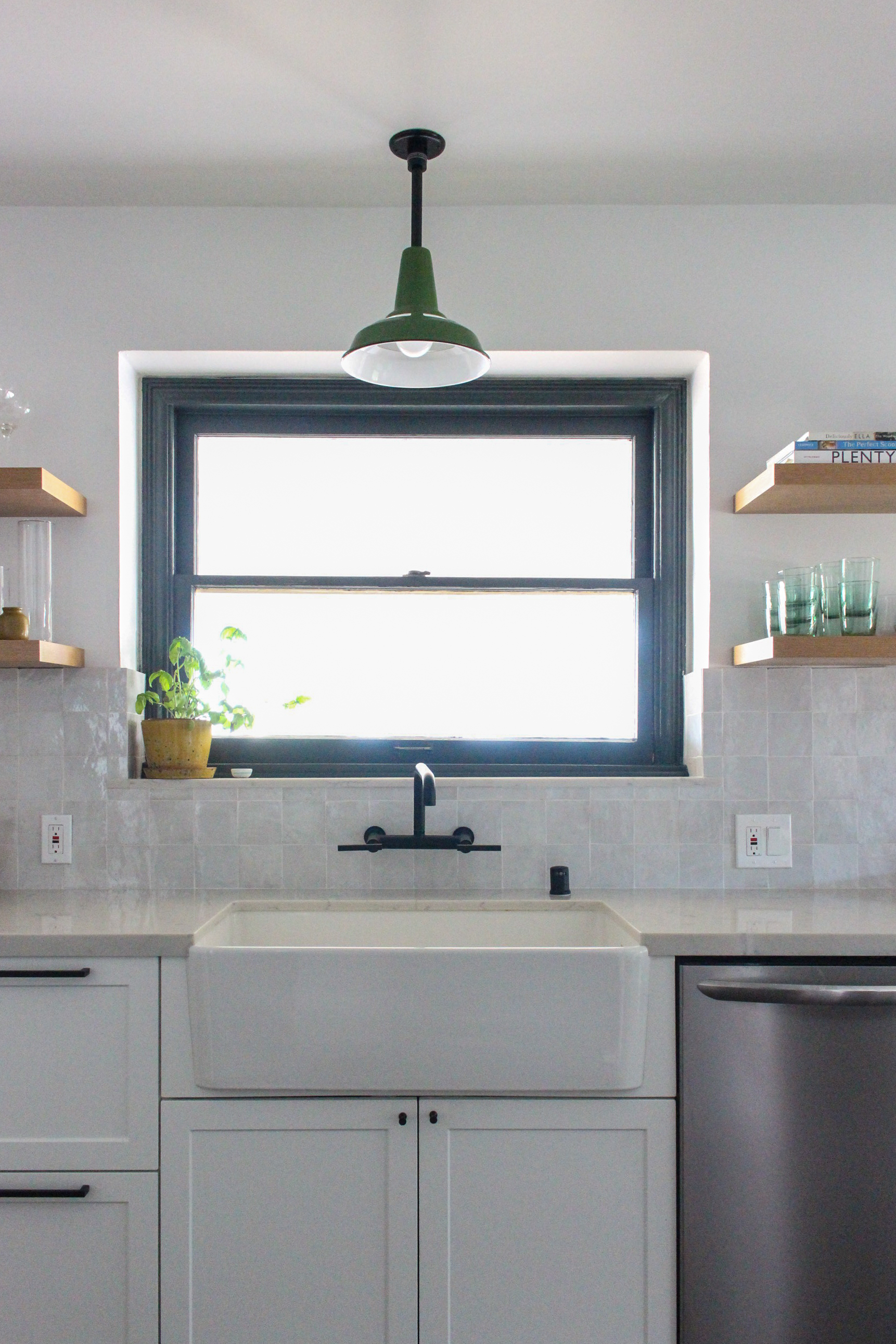
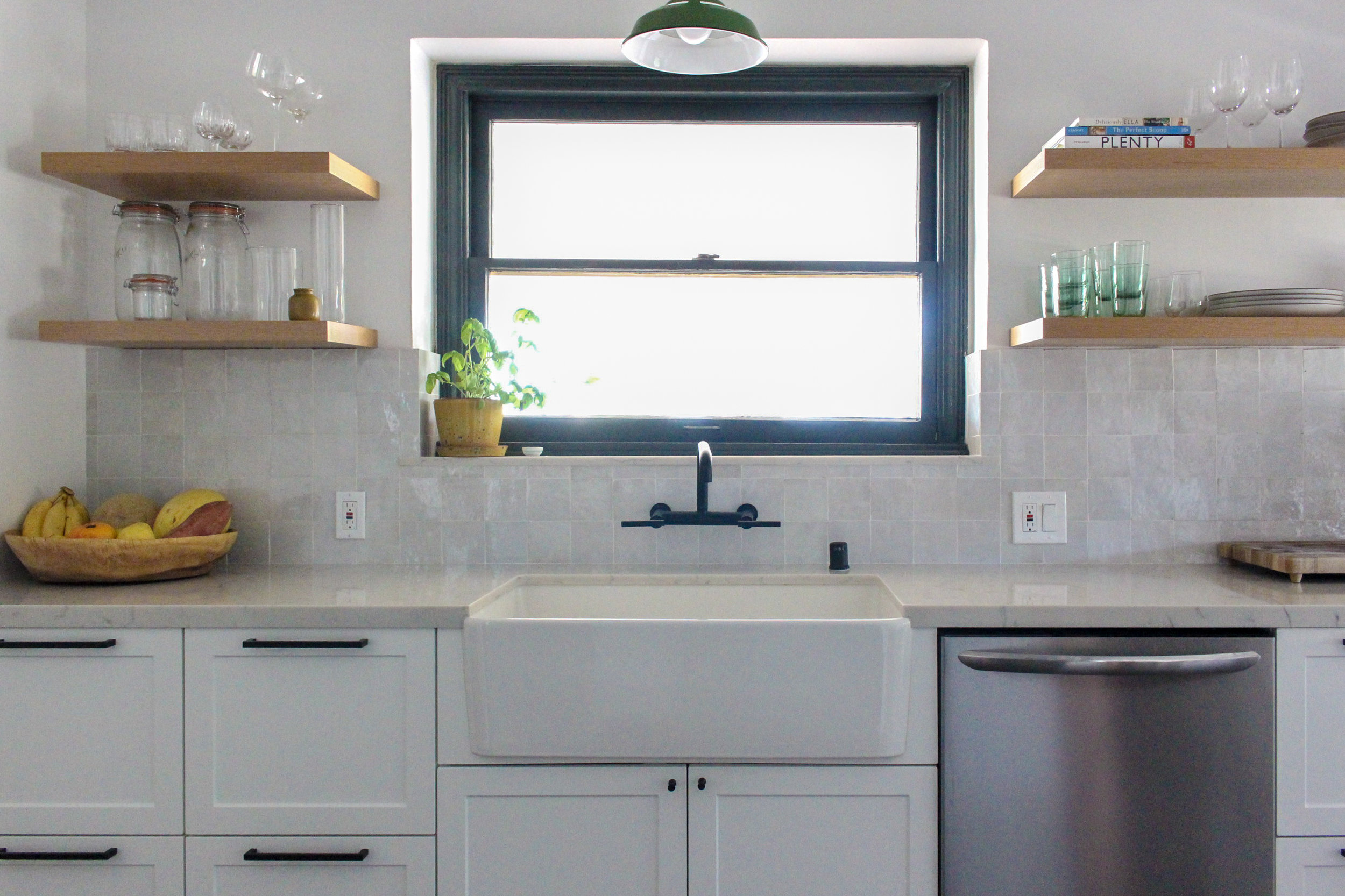
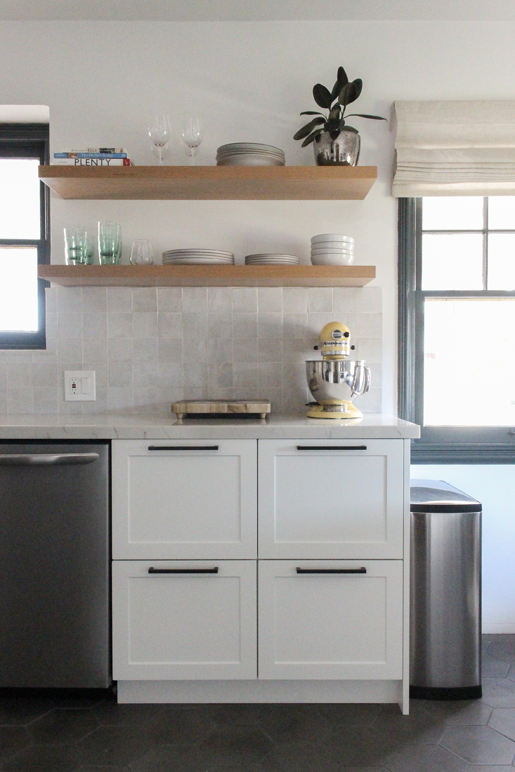
For the cabinets, we definitely wanted plenty of storage, functionality and durability, but didn’t want to break the bank. So after looking at a few options and getting some custom cabinetry quotes, we opted for a middle of the road approach using Ikea for the boxes and drawers, and Semihandmade for the fronts and cover panels. I was able to visit the showroom and see samples in person which was great. They made the ordering process so easy and were always available to answer my endless questions. For the color and style we went a few different directions which included going either black, green or flat panel but after much thought we decided to stick to white shaker, which was consistent with some of the existing built ins in the house. We also have some black hardware accents and wanted to create some consistency there as well. To counter the traditional feel of the shaker fronts we went with a clean, modern drawer pull and a slightly midcentury style knob.
Flooring:
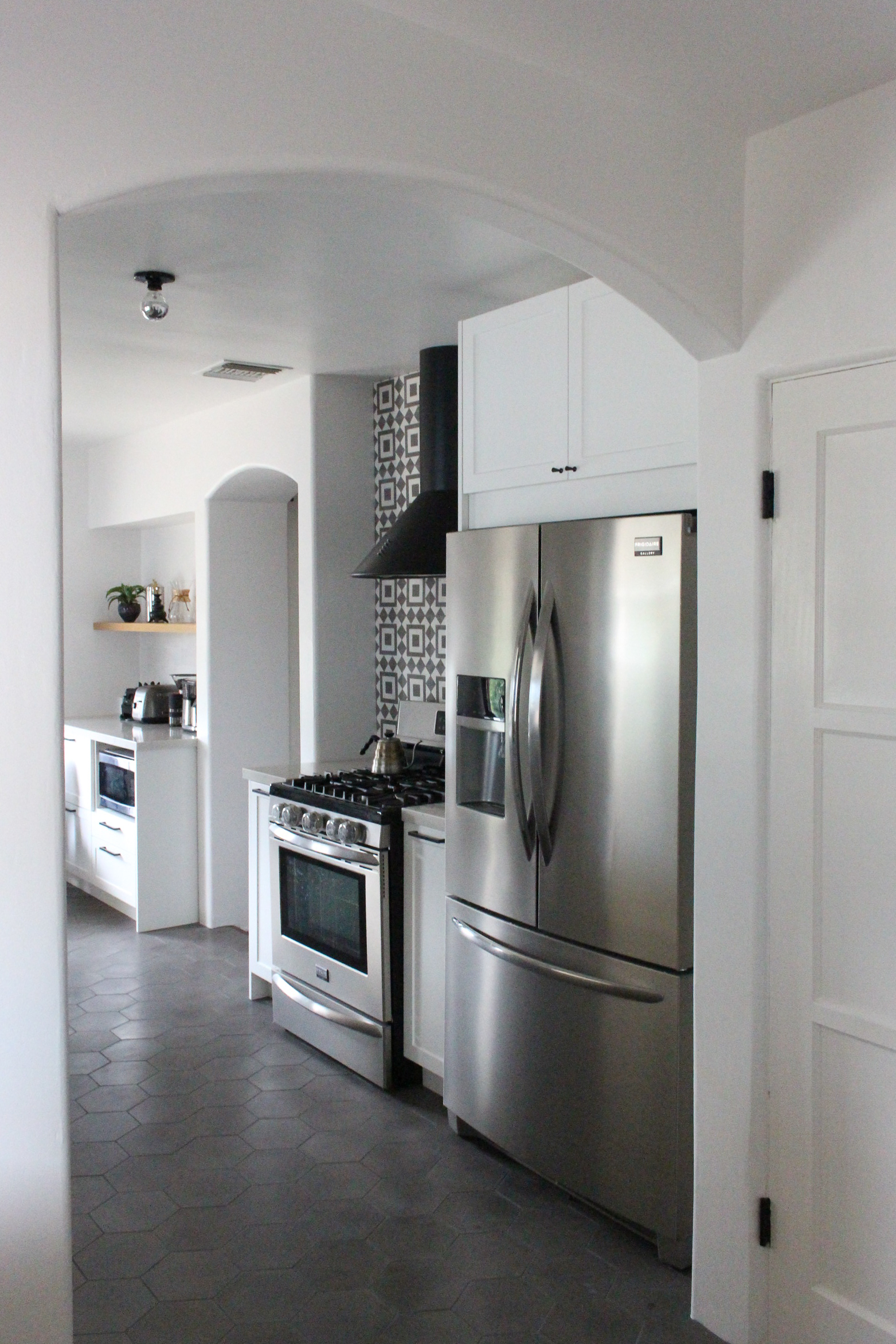
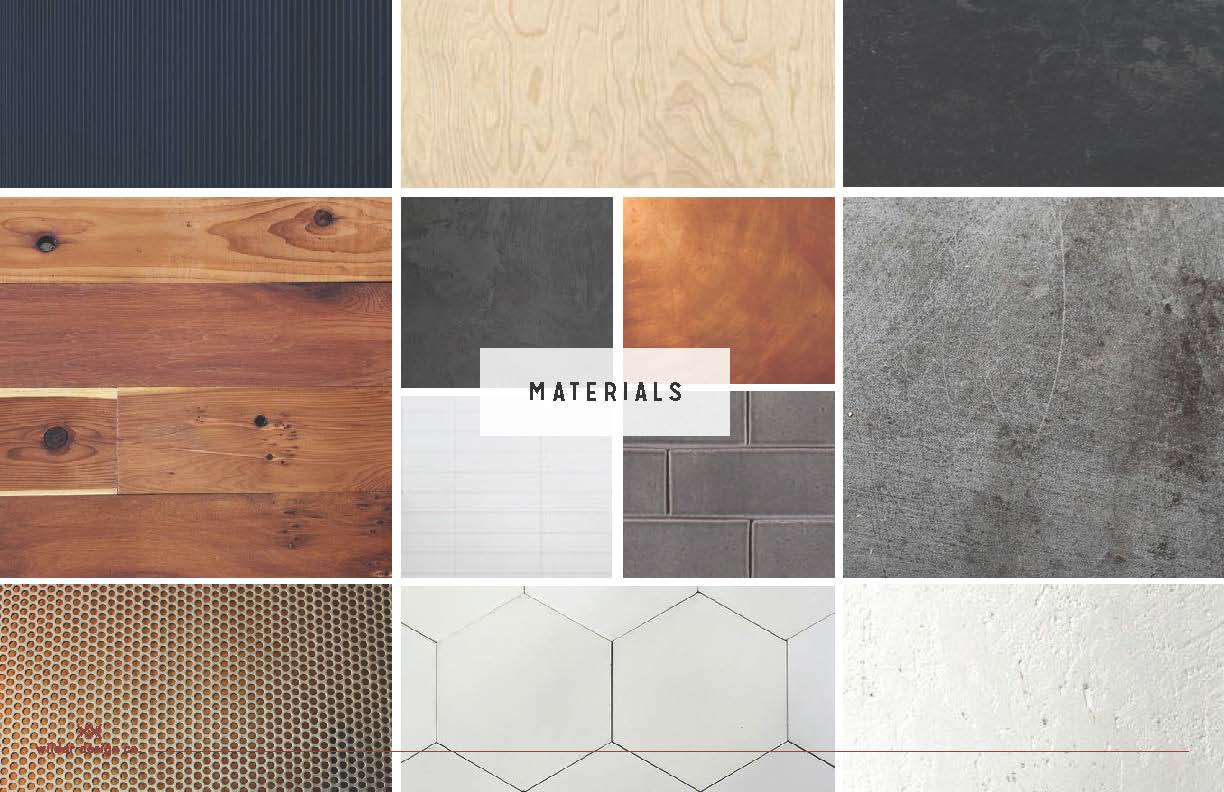
Flooring was one of the primary reasons we needed to renovate the kitchen in the first place (second to the cabinets which were falling apart). The old linoleum flooring was chipped, creaking and discolored - aka barf color. There was certainly no saving it, so we wanted to do something that was durable and was a good transition with the dark wood floors in the rest of the house. After deciding on white cabinets we knew we wanted to go dark with the flooring for contrast, but not black. We landed on a dark grey cement tile in a hexagon pattern, which is a nice nod to our deco inspiration and the tile we used behind the stove.
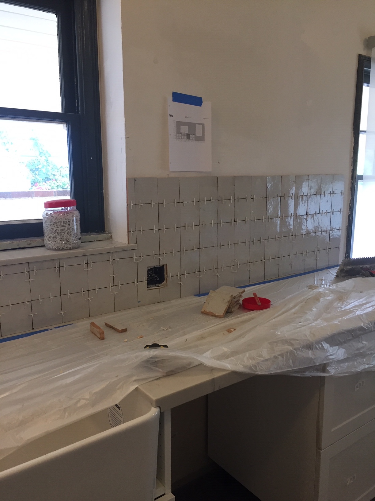
Backsplash:
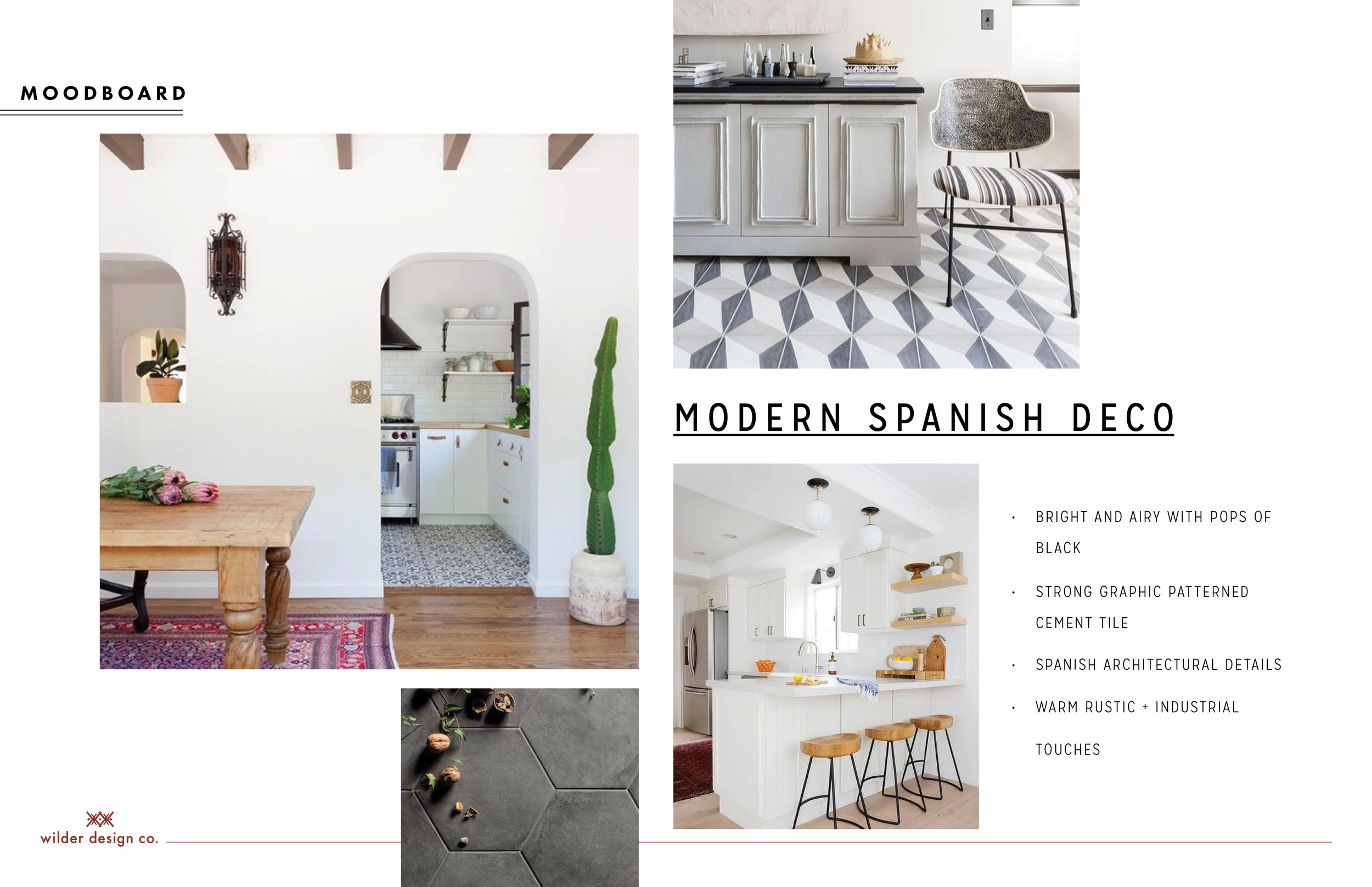
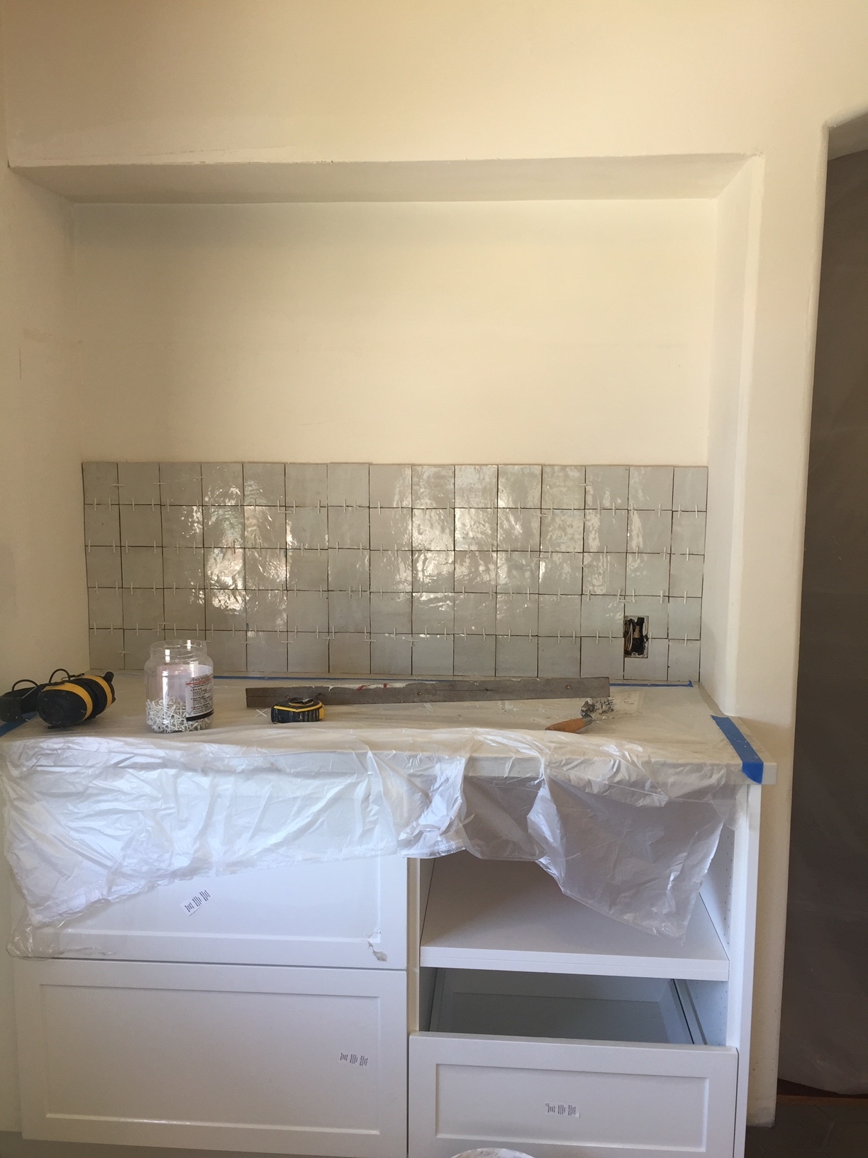
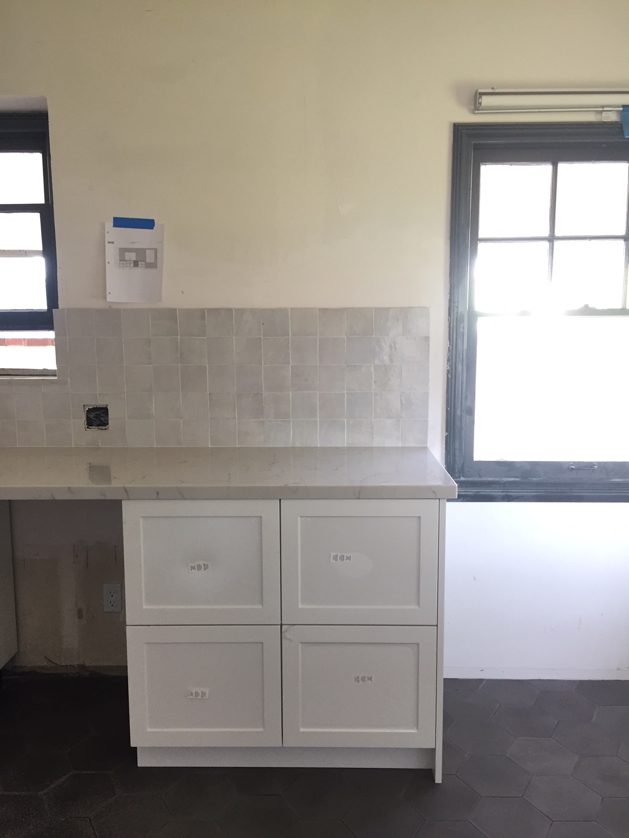
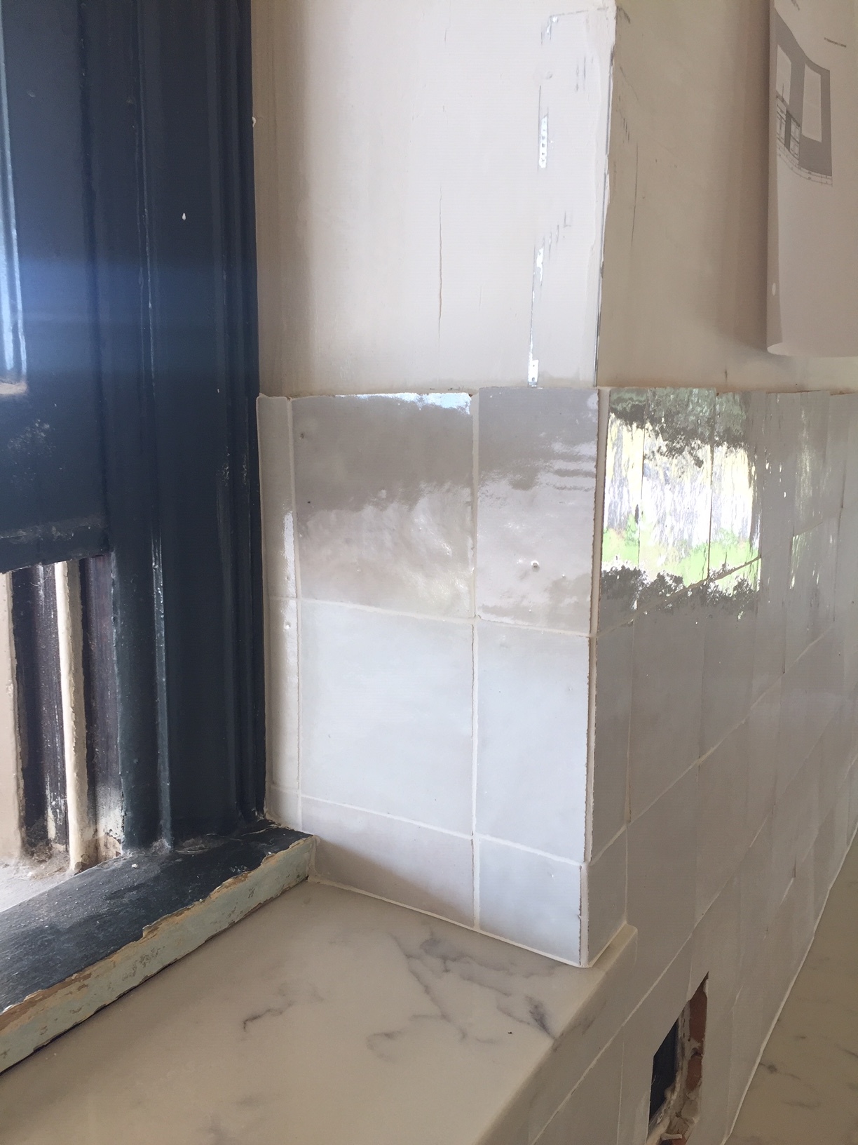
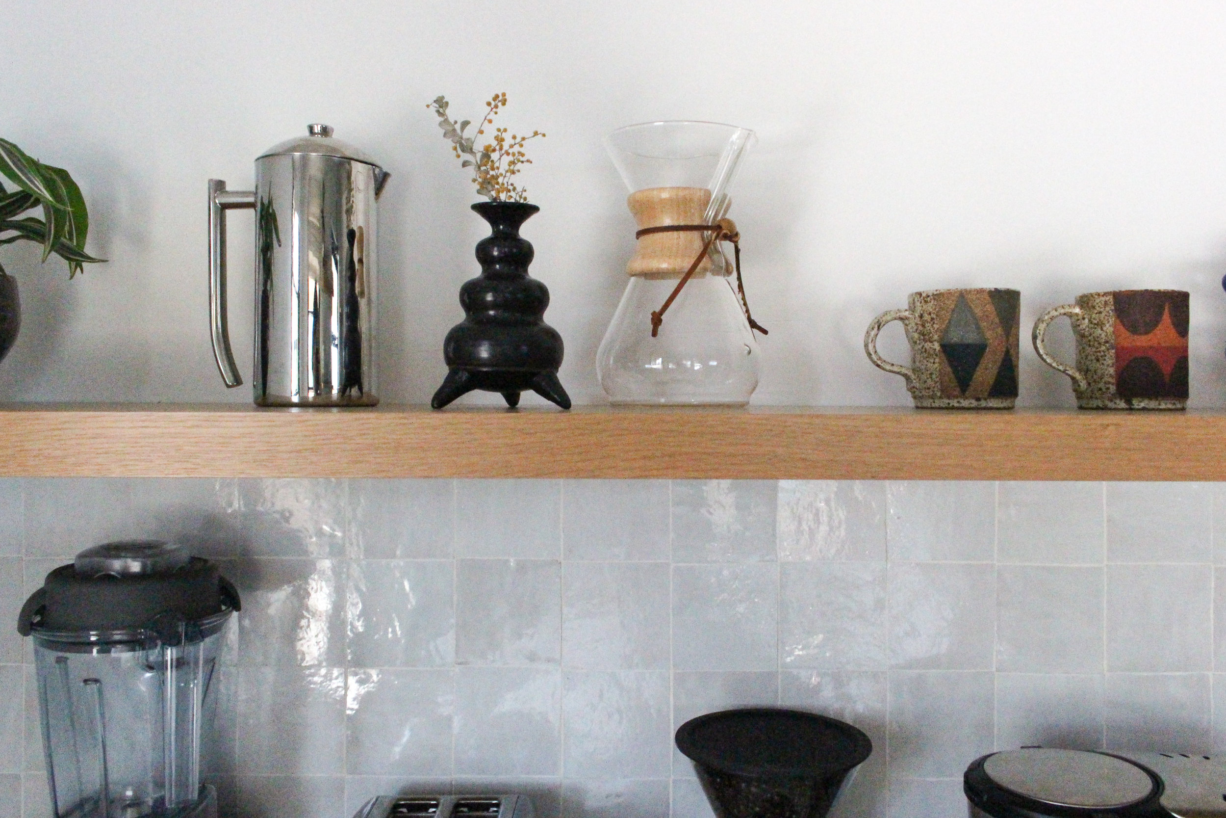
We decided to go neutral with the backsplash - and with the kitchen in general, since kitchens can get pretty cluttered and we wanted to have a calm backdrop for all the visual noise. Multi colored sippies anyone? We didn’t want to go the subway route, or even a geometric pattern or shaped tile. We wanted something that was imperfect and added to the romance that the spanish vibes in the house give off. So after discovering zellige tile we knew we had a winner. We fell in love with the beautiful iridescent, irregular surface and the raw edges perfectly tied into our perfectly imperfect plaster walls. With all the white we needed a bold focal point so behind the stove we went with a graphic moroccan cement tile which would play off the dark floor and the black accents in the kitchen.
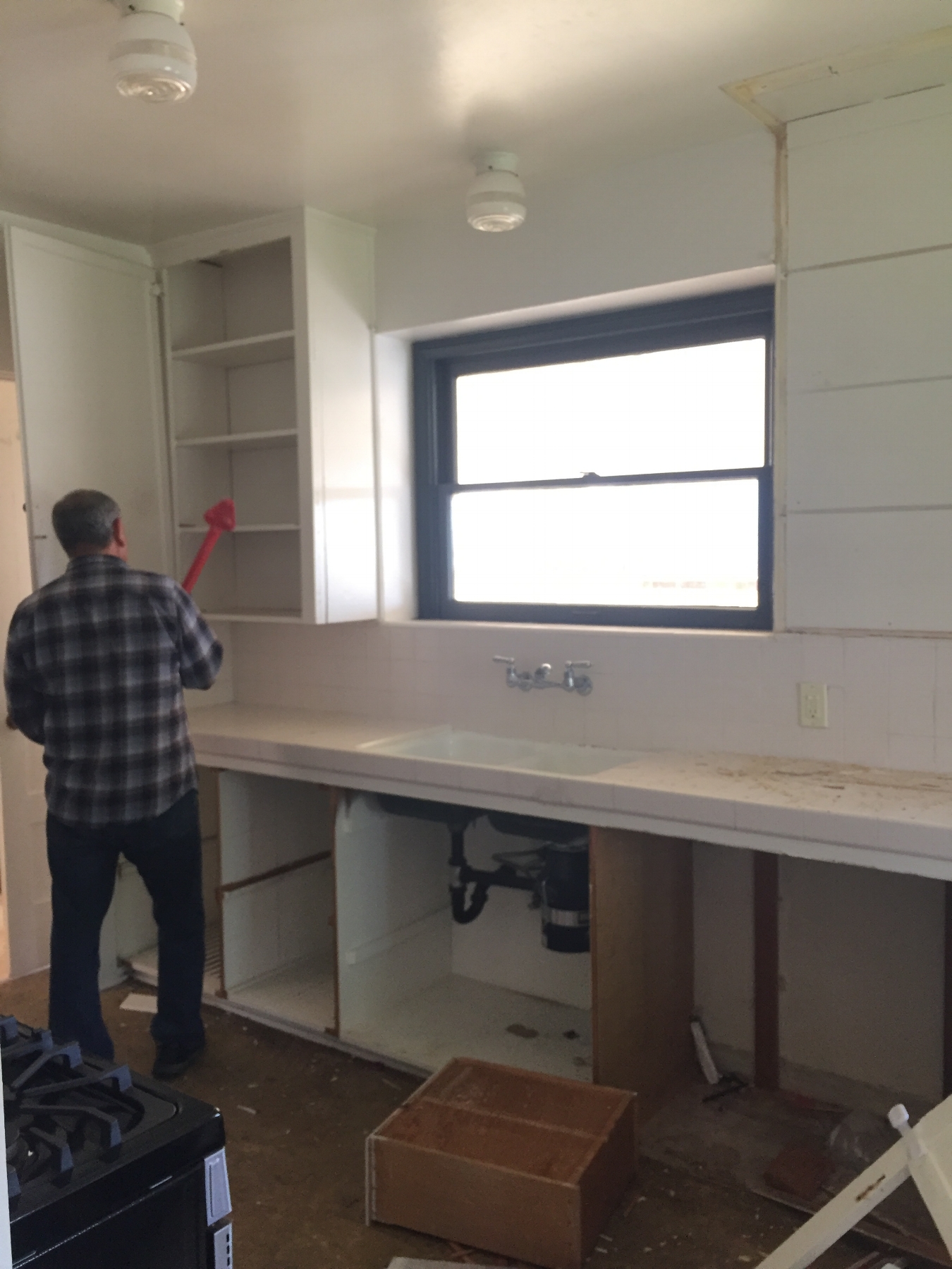
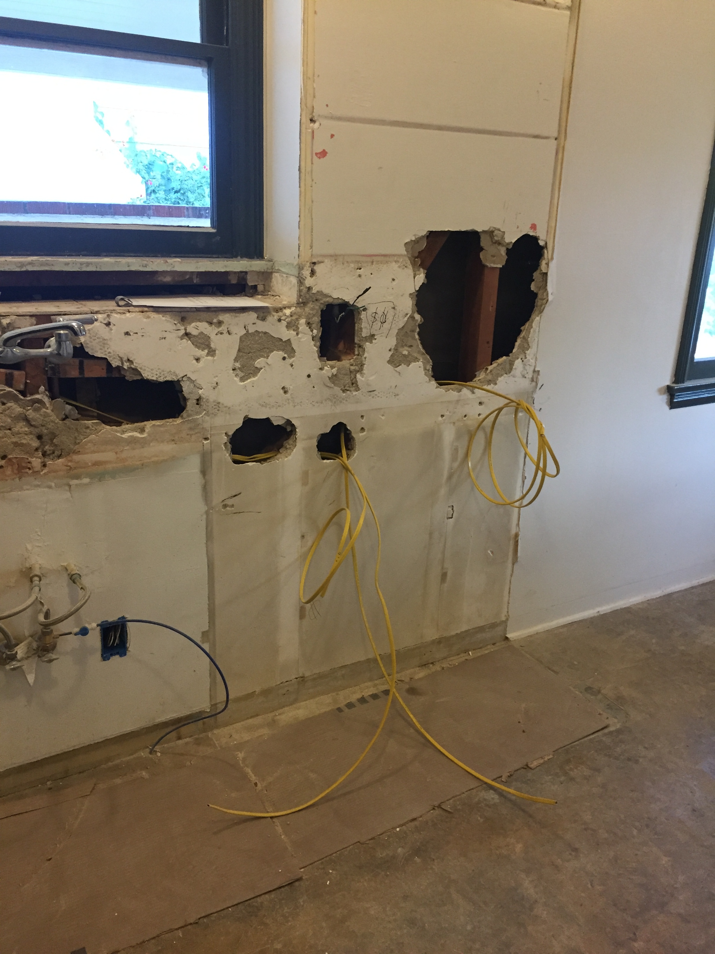
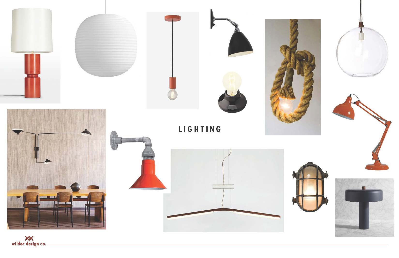
After getting a few quotes from contractors we opted to take the job on ourselves and I’m happy to say our sanity and marriage survived! It was actually a great decision since were able to keep a close eye on everything and ensure the integrity of the design stayed on track. I’ll spare you guys the tedium of the 6 week construction details (most of which was spent waiting for the faucet and light to arrive) and skip right to the progress pics.
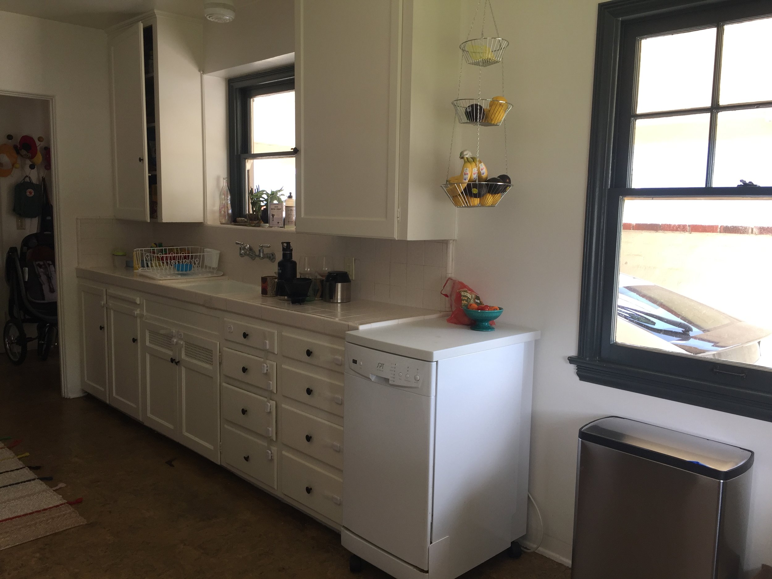
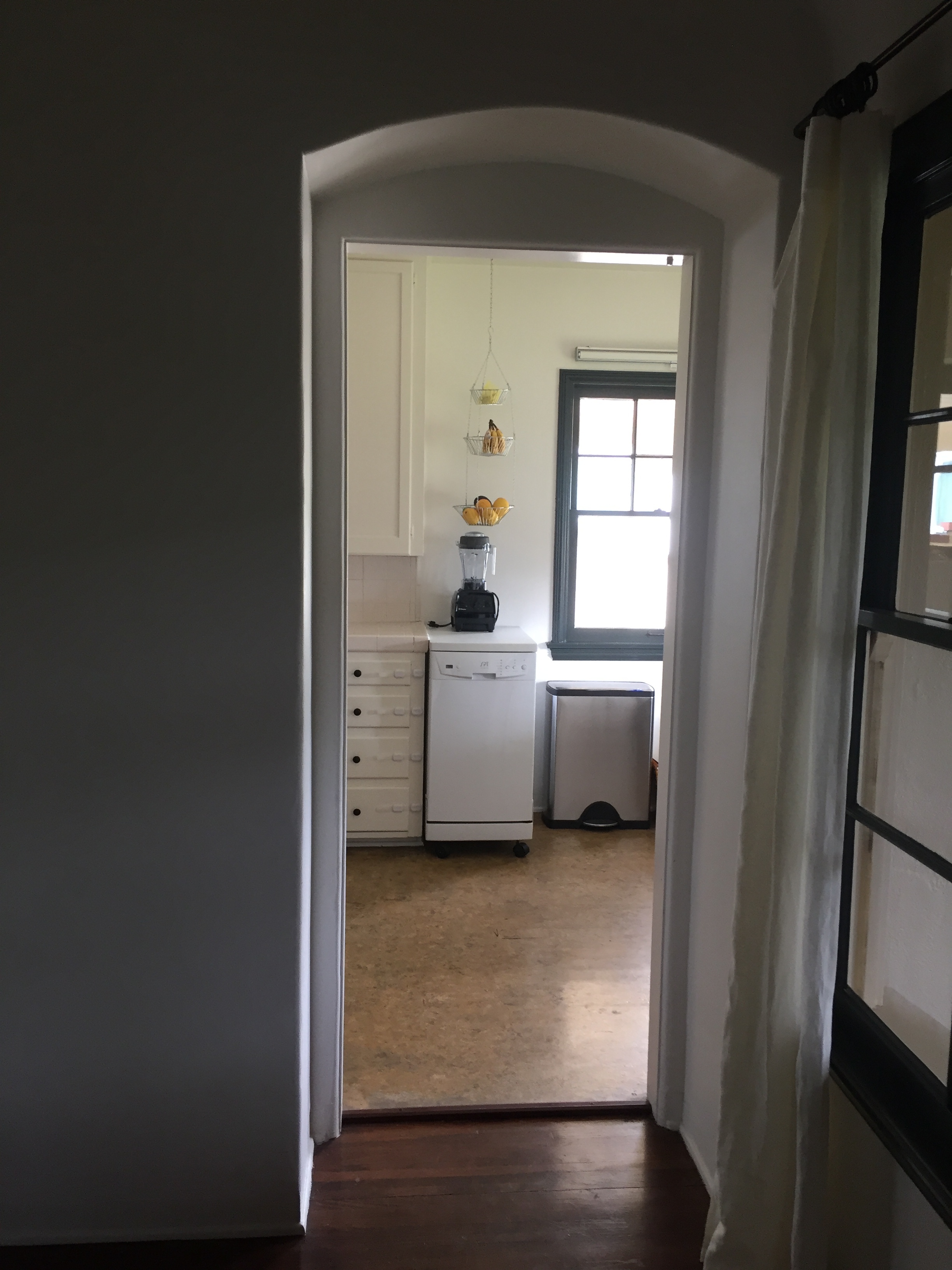
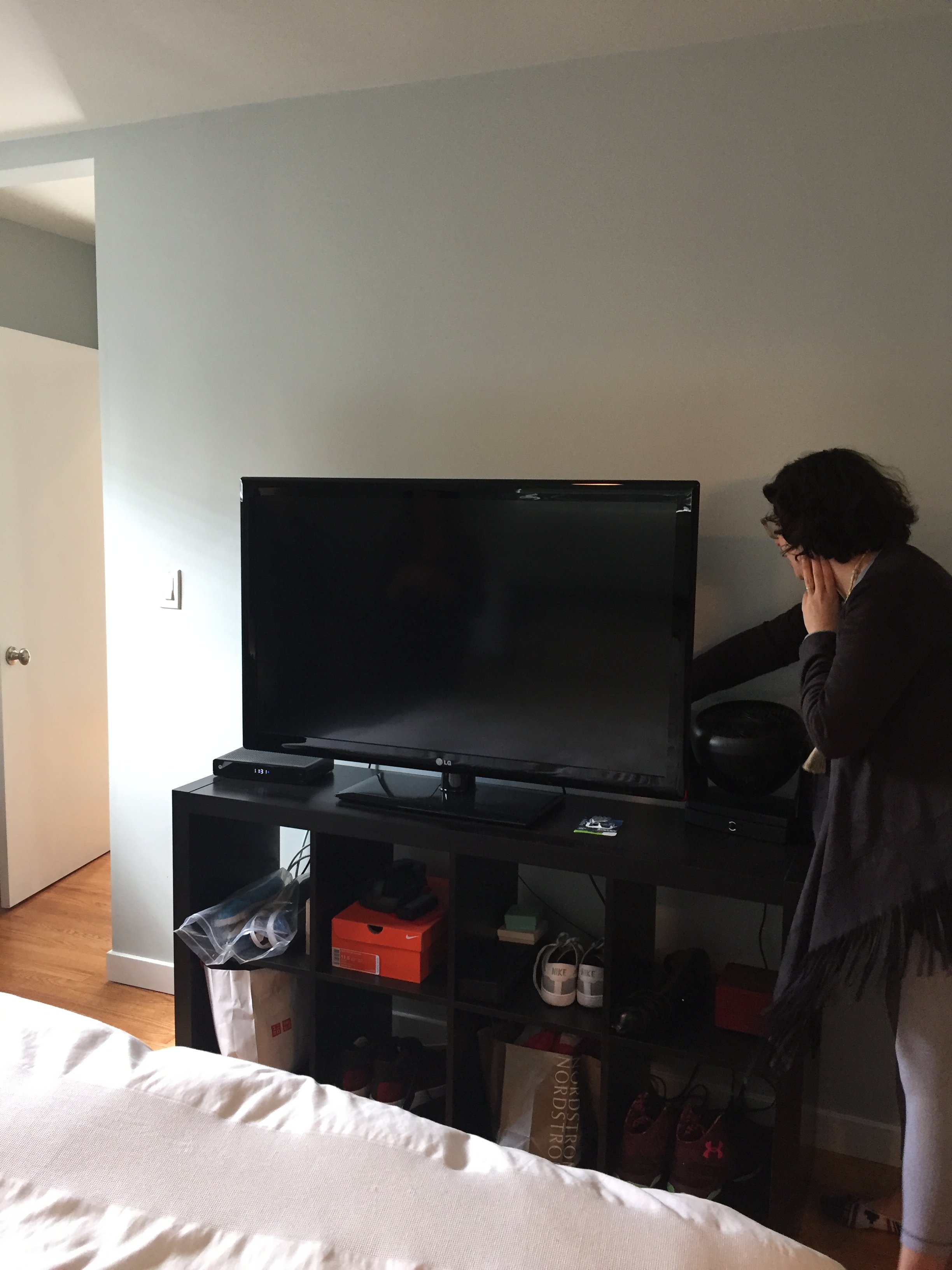
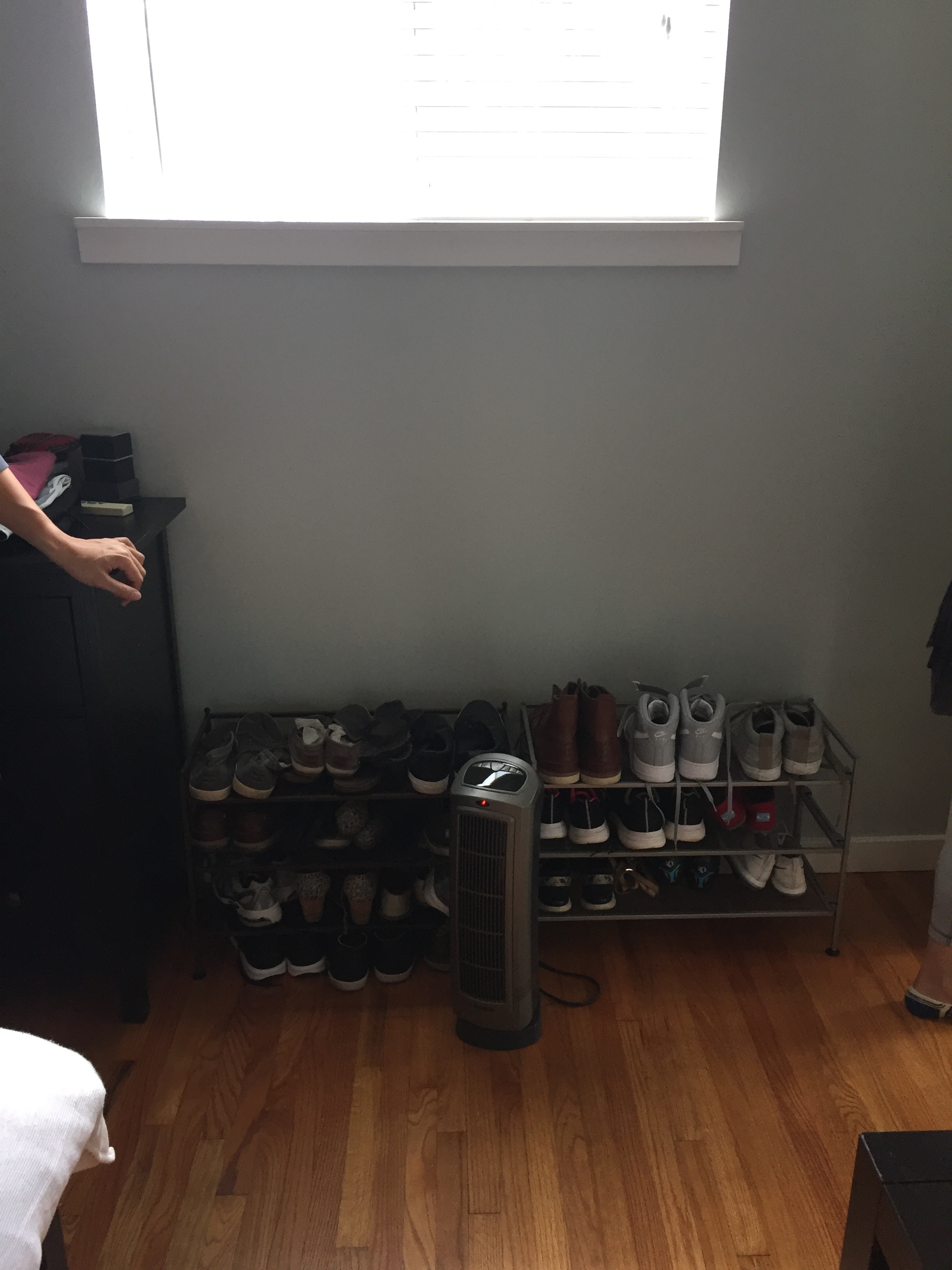
Progress Photos:
After all that hard work, we had a few other loose ends to take care of, like mounting the shelves, ordering window treatments and installing the Elfa system in the pantry. So here’s how it turned out! I hesitate to say its finished because we’re always #housetweaking so in my mind its always a work in progress.
After:
Hope you enjoyed reliving our kitchen reno journey! Now I’m itching to do another one - anyone game? xo -jojo
Equator Coffees and Teas HQ
Hi all - its time to take a little trip down memory lane and revisit a super fun project from last year. It might be appropriate to pour yourself a cup of coffee for this one, since our client makes some of the best coffee around! Not to mention they have some of the most beautiful cafes and branding which served as an excellent jumping off point for the design.
Equator came to us in early 2017 with a big ask - to help them relocate to their very first official headquarters. They were currently running the business out of their roastery, which they were quickly outgrowing. With their retail format and aesthetic beautifully set out by Boor Bridges, they had a good foundation to pull from, but needed to create an added layer of comfort and function for their office. We started with a deep dive into their brand by visiting a few of their cafes and then got into the first stage of design: inspiration and concept development.
Concept:
We built on the industrial and utilitarian materials core to Equator’s palette through adding new materials such as textiles, upholstery, wood and natural wovens. We proposed using textiles and prints that call back to the countries their coffee beans are sourced from, as well as highlight hand made crafts and makers. The goal was to evoke the same feeling of quality and care that is put into Equator’s fine coffee and teas, as well add some whimsy and soul to their sophisticated and urbane aesthetic. Luckily the team at Equator was excited by this concept and we took the next step diving into layout and design.
One design challenge put forth (among many) was to make the office incognito - its located on a very busy street and the Equator name is very well known in the area. So in order to keep people from constantly stopping in and asking for coffee, we opted to go grey with the exterior and keep the signage tonal. We also used Equator’s signature red color as a through line from the exterior all the way through the office.
Upon entering, we wanted there to be a call back to what Equator is all about - coffee! So in the feature wall behind the lobby, there is a mini coffee making kitchenette, complete with beautiful fireclay tile. Another challenge in the space was to disguise the exposed ductwork and revamp the stairwell and railings. I had the good fortune of collaborating with architect Jessica Fairchild of Jessica Fairchild Broms Design on the final stages of design, and Jessica came up with an excellent baffle system that did both, and is a stunning feature in the space. We opted for semi-transparent glass walls and doors to keep the small space feeling open, and used linoleum flooring to help absorb noise and (bonus points!) has a great sustainability factor.
Downstairs the team needed a training lab for the cafe staff to train in, and also to host community cuppings. For that reason the space needed to be very flexible, so we devised a system of rolling cafe carts, mobile tables and stackable stools to best serve these needs. There is also ample storage for equipment and a projector for presentations. In the area outside the lab, there is a kitchenette for employees, as well as casual banquette seating for staff or event attendees. A fun little space is the phone booth which is where employees to make private phone calls or have conference calls during the work day.
Final Design:
As most projects go, there were a few changes made to the design throughout the permitting, construction and purchasing phases. Fortunately a lot of the concepts made it through and I was able to get a first hand look at the space earlier this year and shoot some photos. Here they are, and in order to get the full effect, I included the before photos, along with the afters. (Cue mind explosion) Hope you enjoyed this little recap as much as I did!
xo - jojo
Before:
After:
(First two photos were taken by Christian Broms)
Yali's Design Process
Ok, its been a minute since we finished up our Yali's cafe projects and I haven't had a chance to share the whole reveal - but better late than never, so let's get to it! For those of you who haven't been following along, we've been working over the past year with our friends at Yali's who operate a chain of family owned cafes in Berkeley, CA, and we specifically helped with two cafes located on the UC Berkeley campus. Fun fact: this project came along from a close friend whom I worked with at TOMS so it was a no brainer taking this project on, and also because it happened to be one of my favorite kinds of projects, cafe design! I'll do anything for coffee.
First, let's travel way back to June 2017 when we kicked off the project. Previously I've shared the branding process for Yali's (for a refresher check it out here) and needless to say the creative direction for the brand played a big part of the interior design process. The goal was to bring a decidedly minimal and modern approach to the space, a space which was previously a Peet's Coffee outpost complete with wood panelling, granite counters etc. (insert frowny face here). The owners have a deep love for all things coffee and wanted to reinvent their cafe aesthetic within the tone of other third wave coffee brands, but without taking themselves too seriously. #fourthwavecoffee (trademark pending) So in building the palette, we were inspired by natural, utilitarian materials which made for a neutral and quiet backdrop backdrop for college life.
Inspiration:
In terms of the cafe layout, we had a LOT of space to play with, so I focused on creating distinct seating arrangements to keep things fresh for repeat visitors, as well as offer various seating opportunities for individuals and both large and small groups. I also tried to utilize all the little nooks and crannies to break things up and help create a nice flow through the cafe, being mindful of where the queue would build up during rush hours.
The kitchen layout was another challenge altogether as it had to accommodate a wide variety of food preparation areas, on top of coffee preparation, smoothie preparation and dry+cold cases at the front of the bar. I leaned on the owners a lot for this part and we must have gone through at least 15-20 different layouts until we nailed it. This is why I love these clients so much - they had so much patience through the whole design process and great communication skills, which really made the everything run smoothly, as opposed to being a hot mess. Bravo! And a huge shout out to Skiffmade for doing an amazing job realizing these designs, as well as being excellent collaborators. For those of you who enjoy floor plans and elevations, (me!) here is the design plan.
Layout:
I love sharing the design process because, we'll I'm a process nerd and love talking shop. But in the end its all about those pretty pictures! I was recently able to get up to Berkeley and take photos, so here's the final product, enjoy! Side note - a few items are still in the works, namely updating the ceiling and adding new lighting throughout. But the space still feels so nice! Stay tuned for a post about the second Yali's location we worked on, complete with before and afters. xoxo -jojo
Master Bedroom Refresh
After finishing our clients' living room and nursery, they decided to finally tackle a space thats just for them. For their master bedroom they wanted a serene retreat but with a little dash of fun. Working off of their existing steel bed frame and wood nightstands, we layered in textured bedding in grey and blue tones, along with pops of yellow and brass elements. They had a serious need for extra storage (can you say shoes?) so we resolved this by adding a credenza under their TV and placing a shoe storage unit in a convenient little nook that also doubles as a mini vanity space. Score! We were all very happy with how the space turned out, and good thing we finished it when we did - because their little one arrived shortly after! Check out the how it looked before, design concept and photos of the finished space and let us know what you think!
xo, k&j