Hi all!
I thought it would be fun to do a little overview of the branding process for Yali's Coffee. Yali's has been around since the early 90's and hadn't had a brand update since the very beginning. Needless to say it was time for an update - and it happened to coincide with the opening of their new location on the UC Berkeley campus, which we designed as well. Taking inspiration from the new cafe location inside the CITRIS building which houses the engineering department among many others - the aesthetic shifted towards a structured and minimalistic style. But with a little fun to keep it feeling fun and young since after all, they are on a college campus.
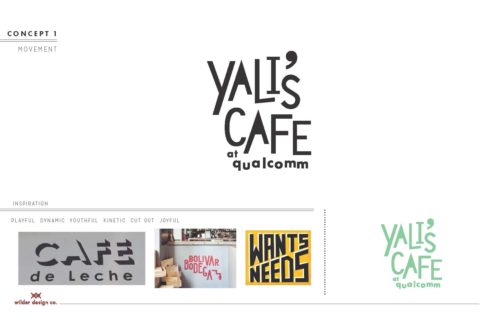
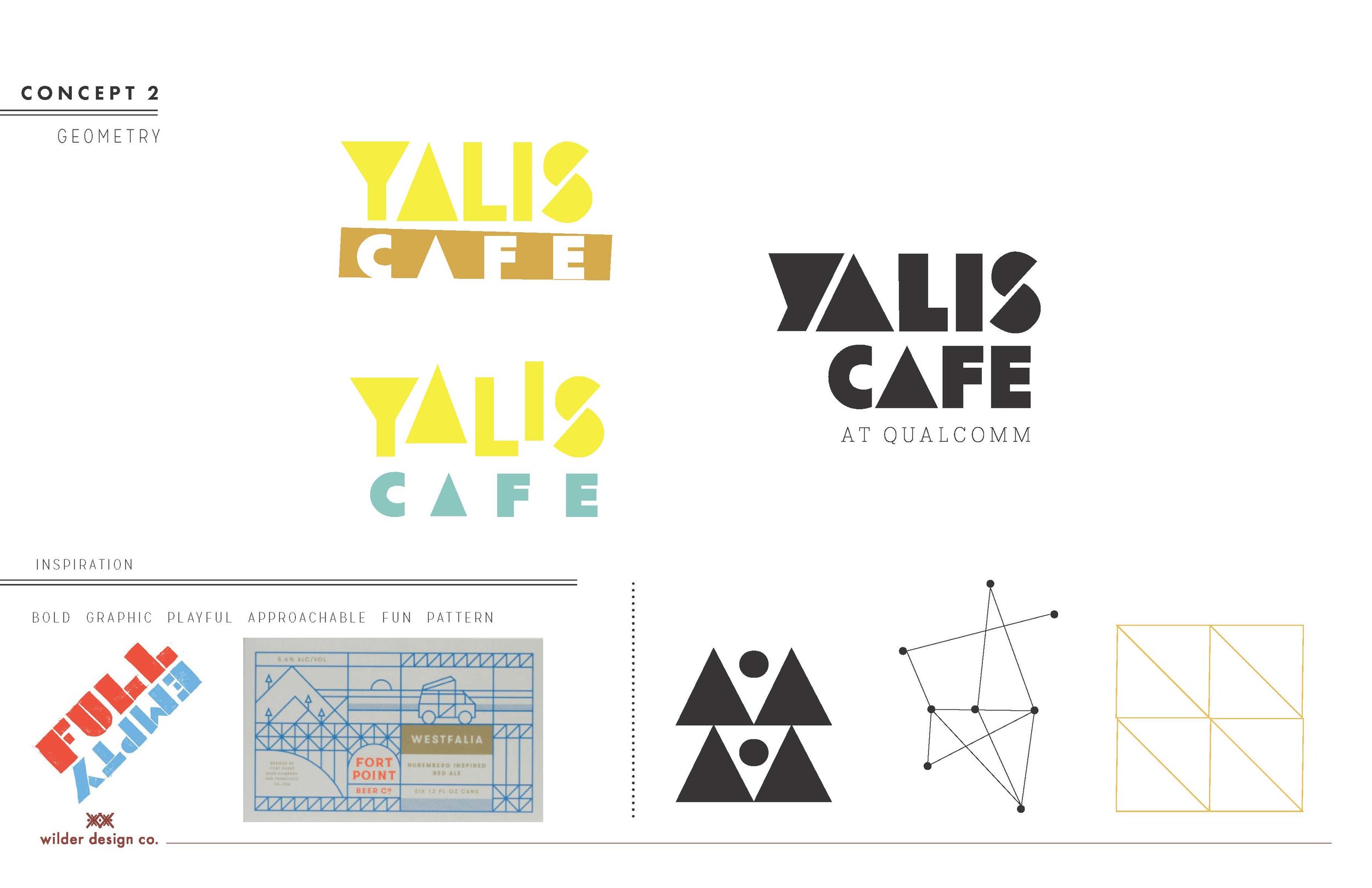
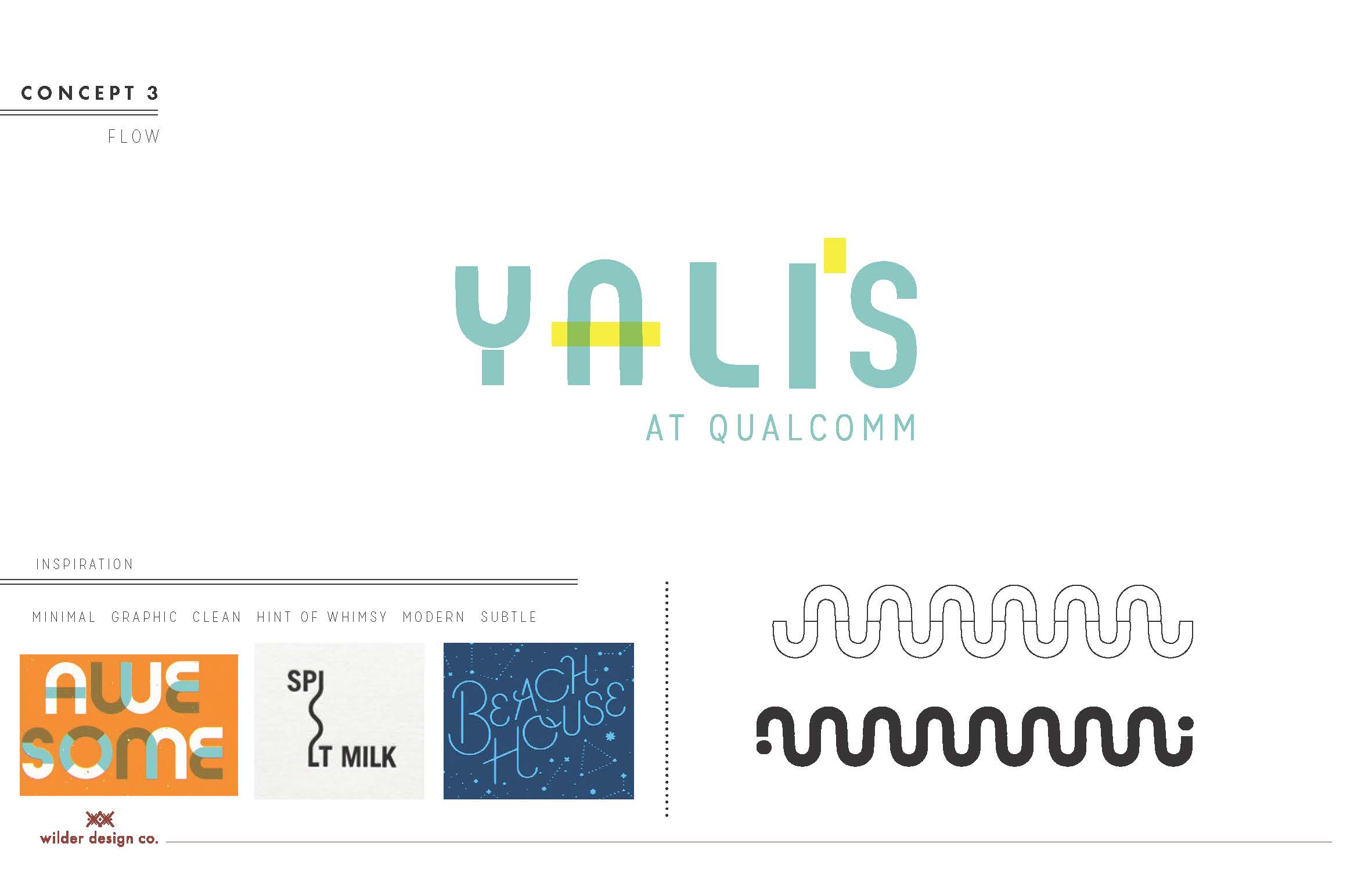
First we looked at a spectrum of coffee brands so we could identify the appropriate voice for the branding. Our clients chose to stay right in the middle between quirky and clean so our exploration began there.

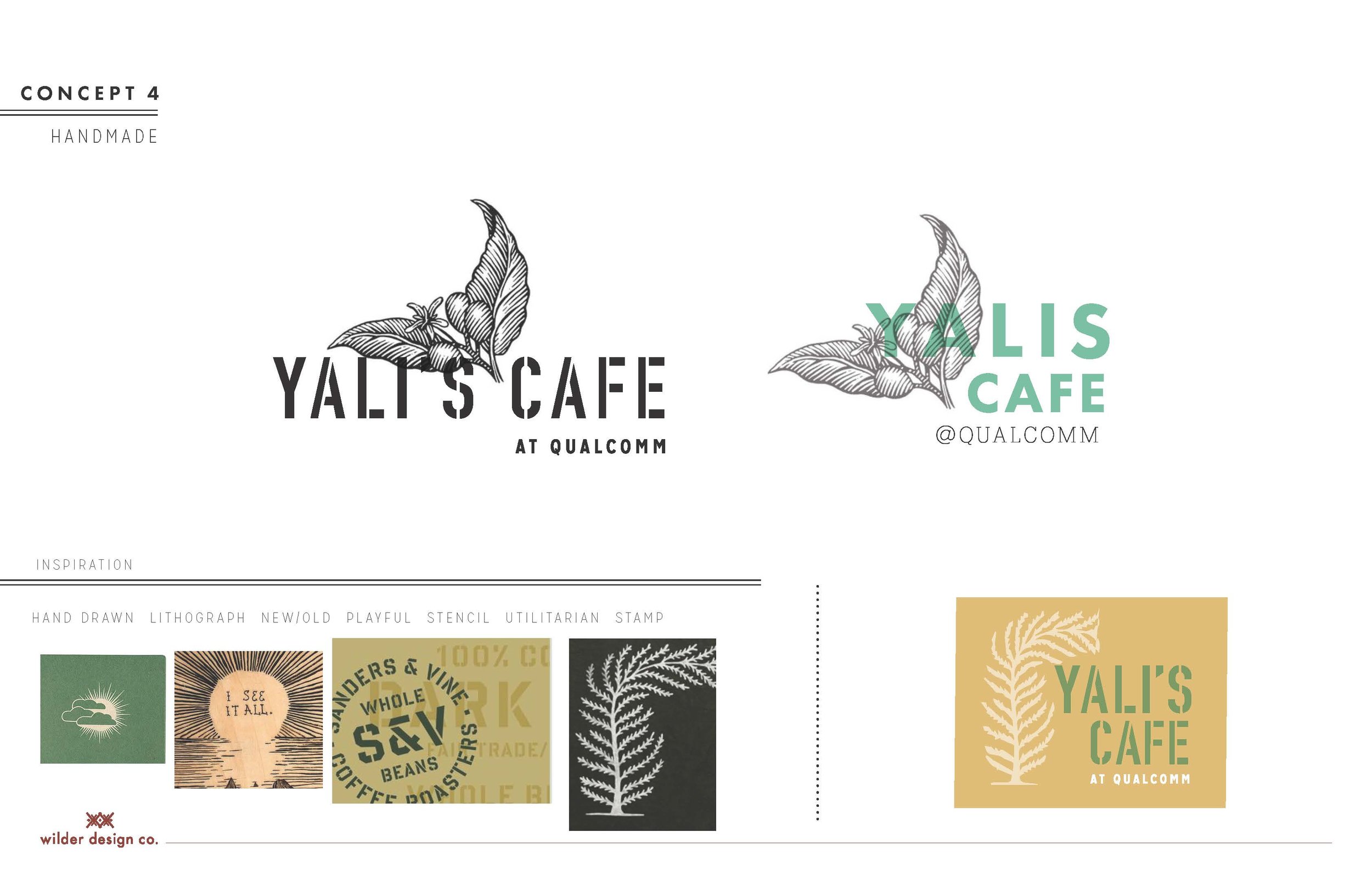
Our initial explorations ranged from playful to clean and our clients decided to go with option 2 and 3 for further development:
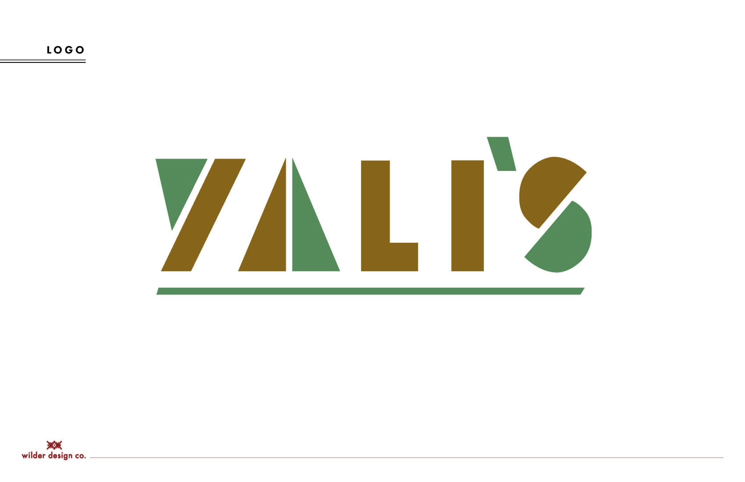
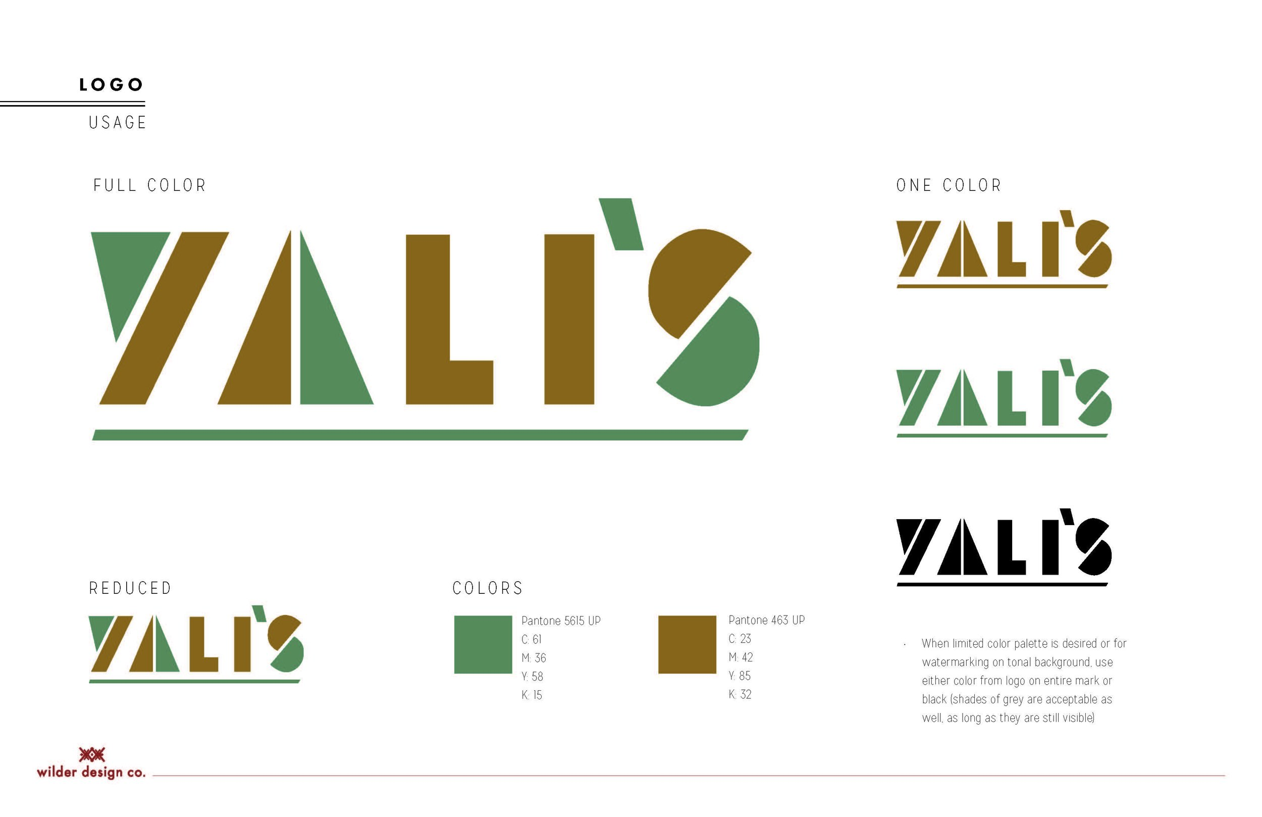
After a lot of refining and color exploration the final logo mark was selected:
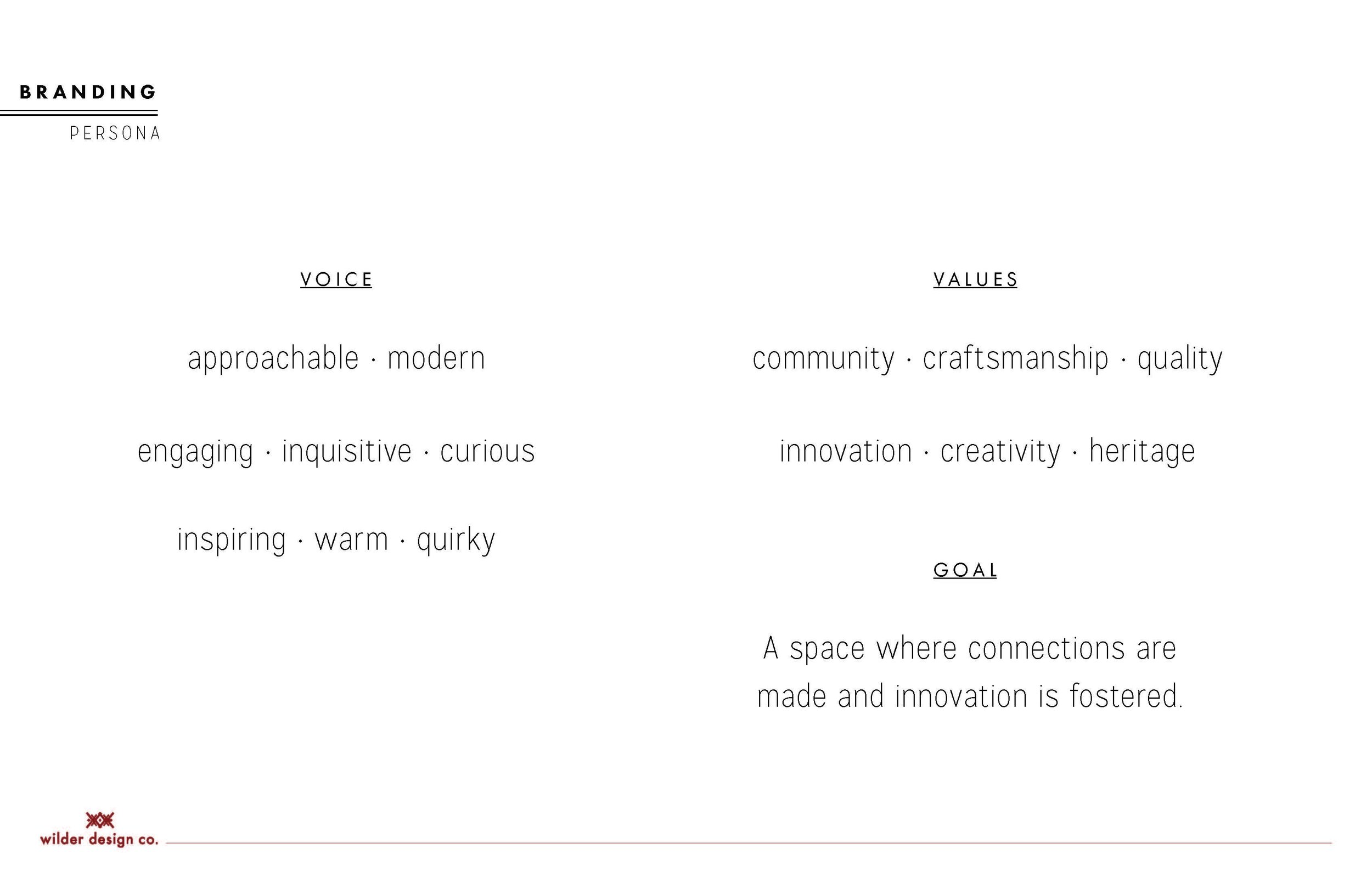
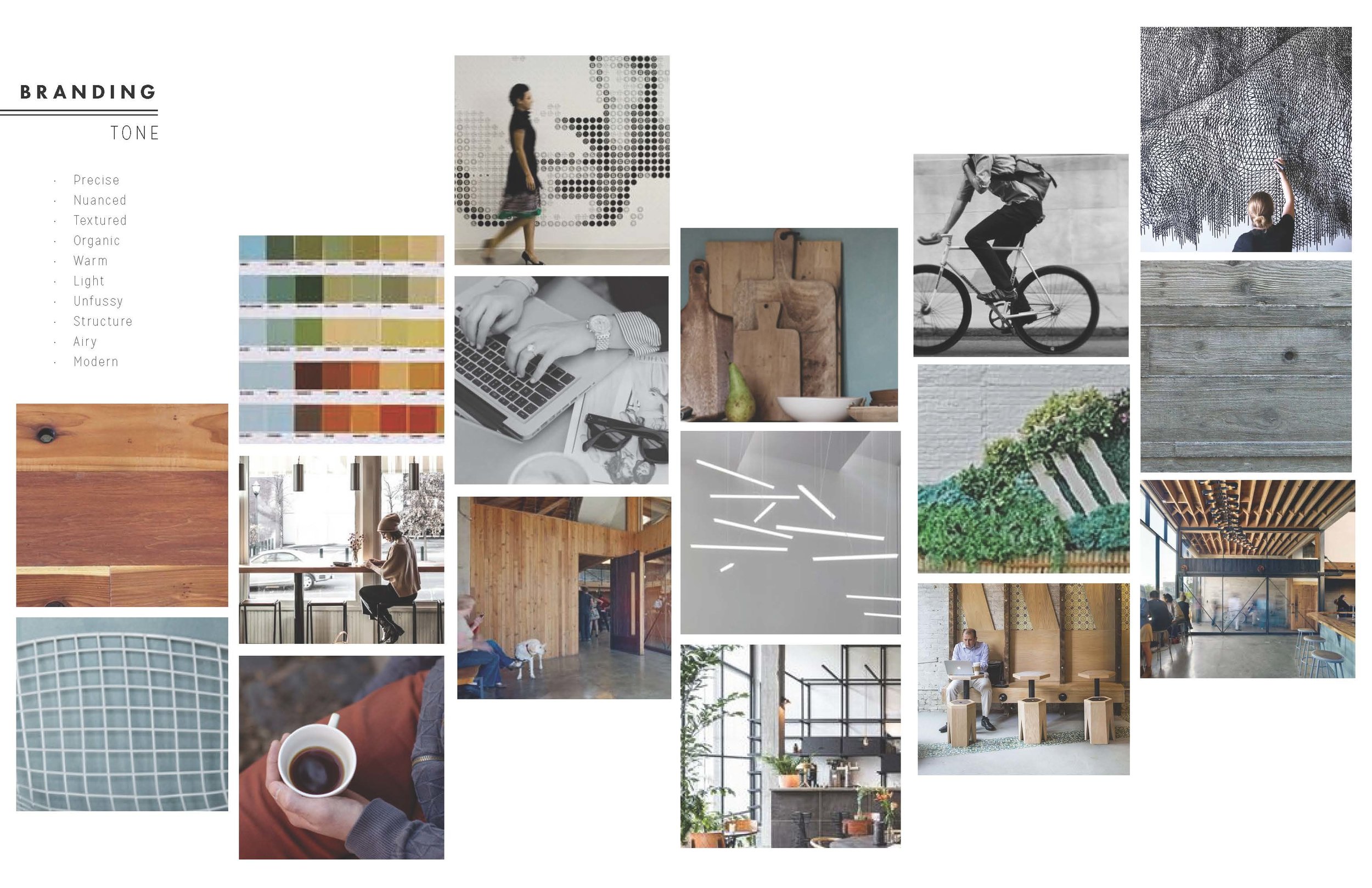
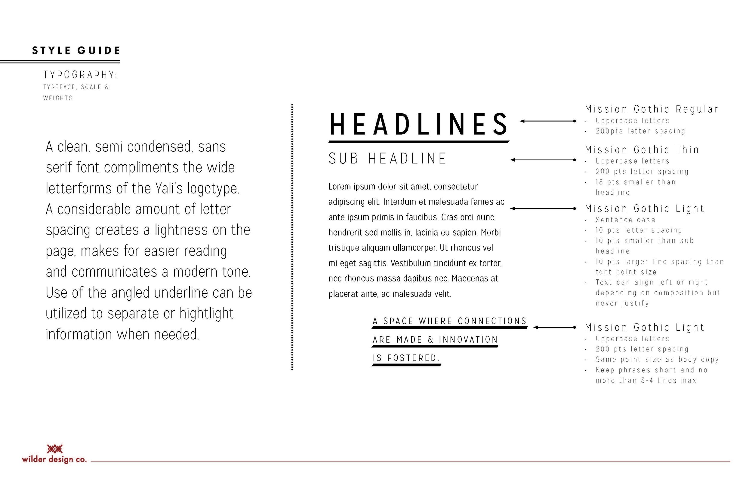
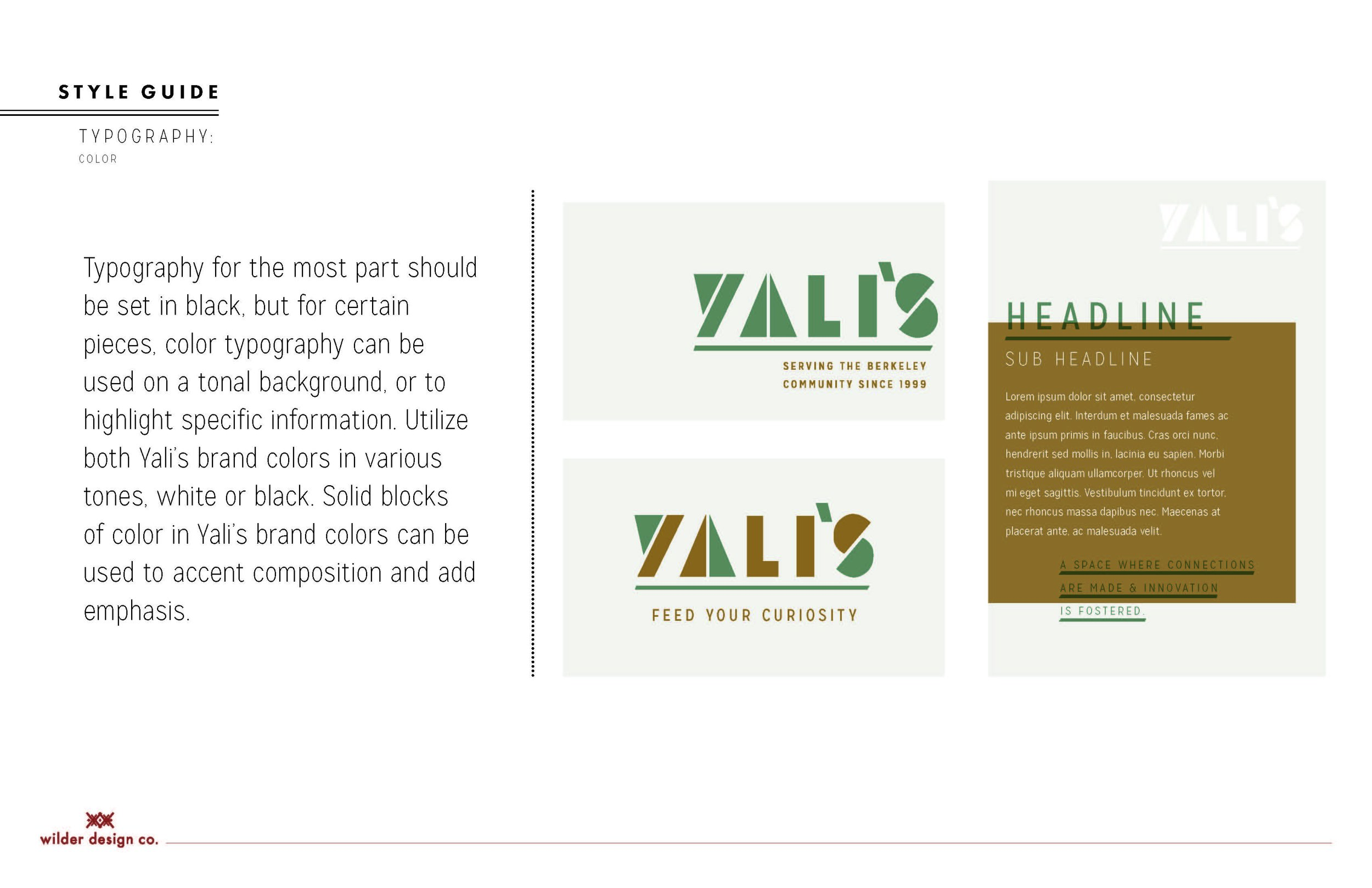
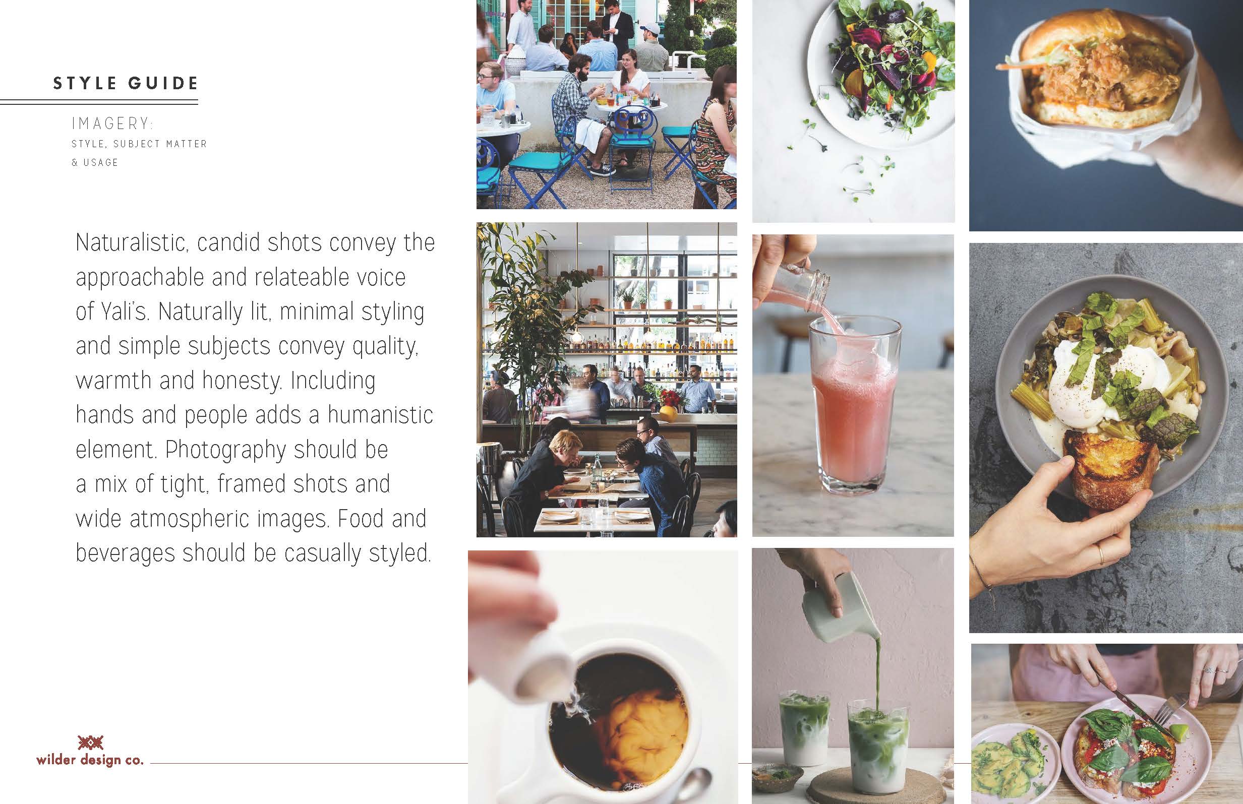
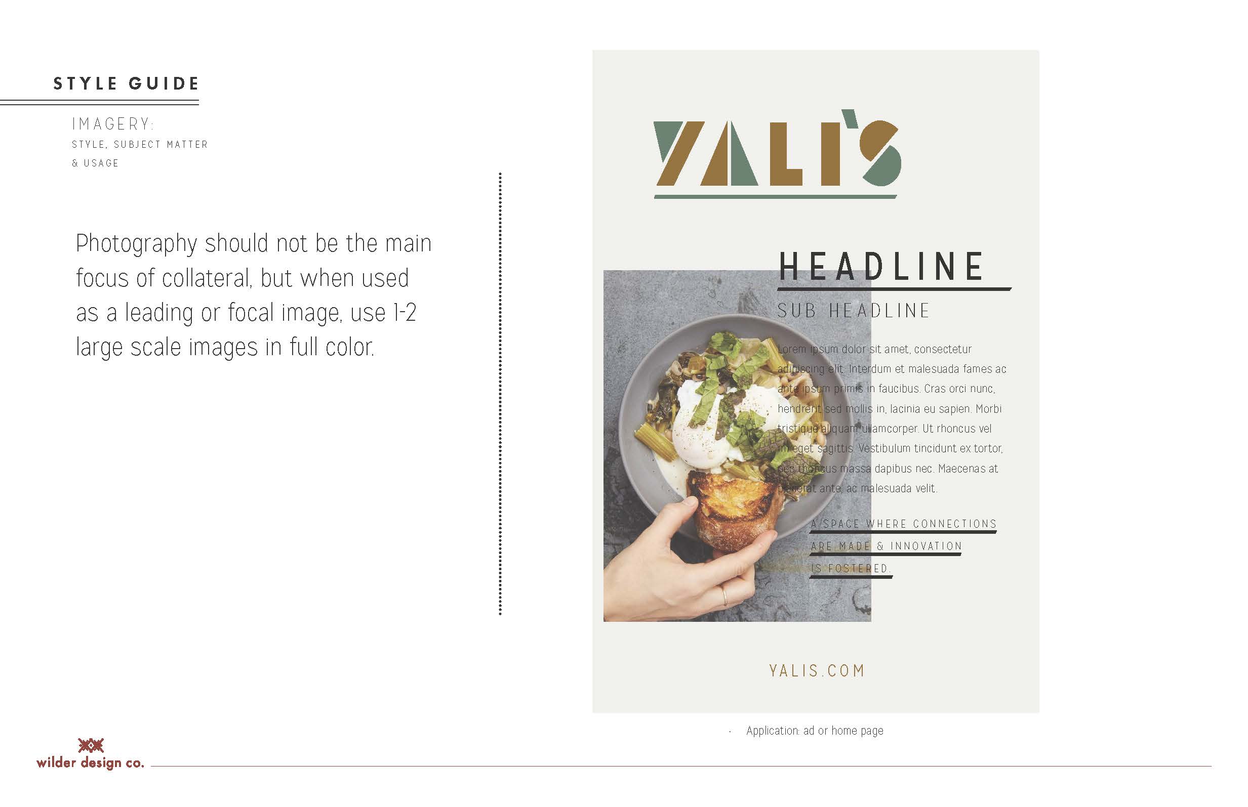
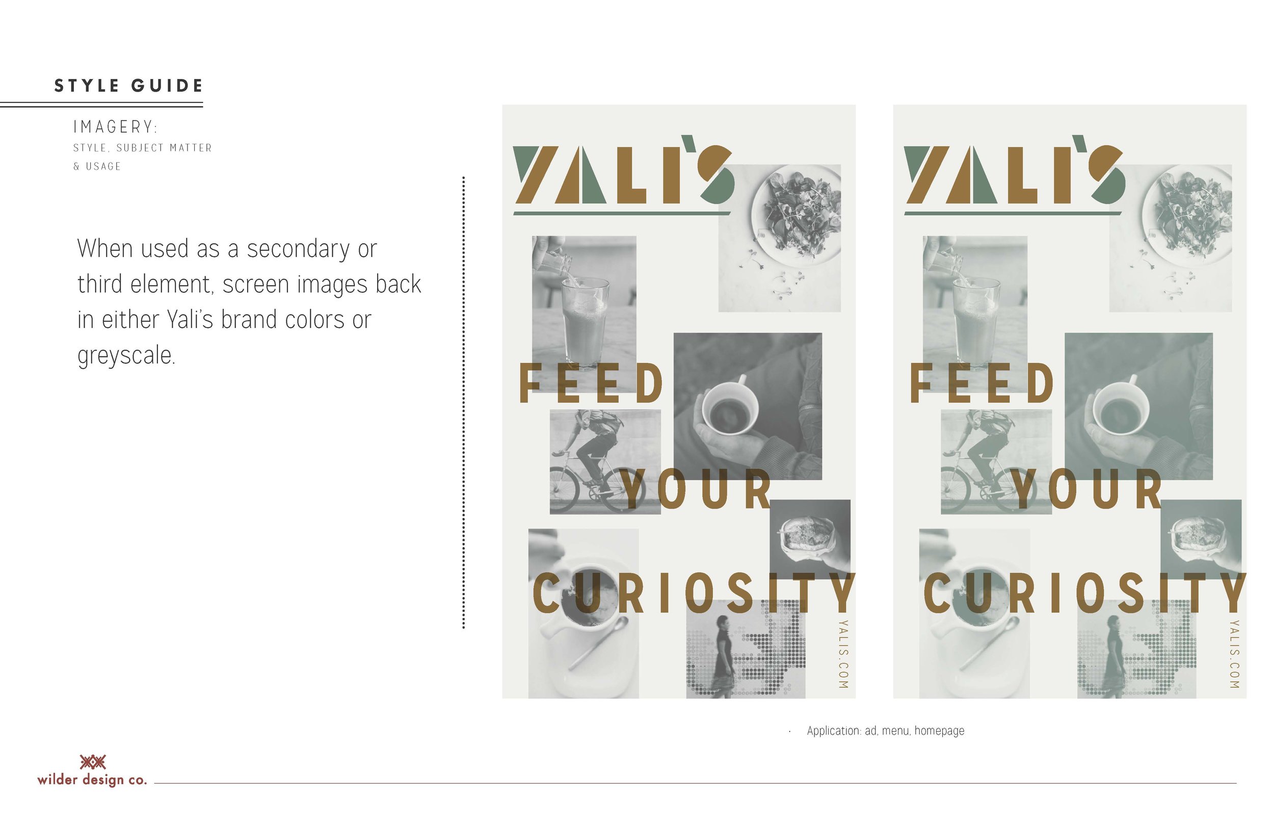
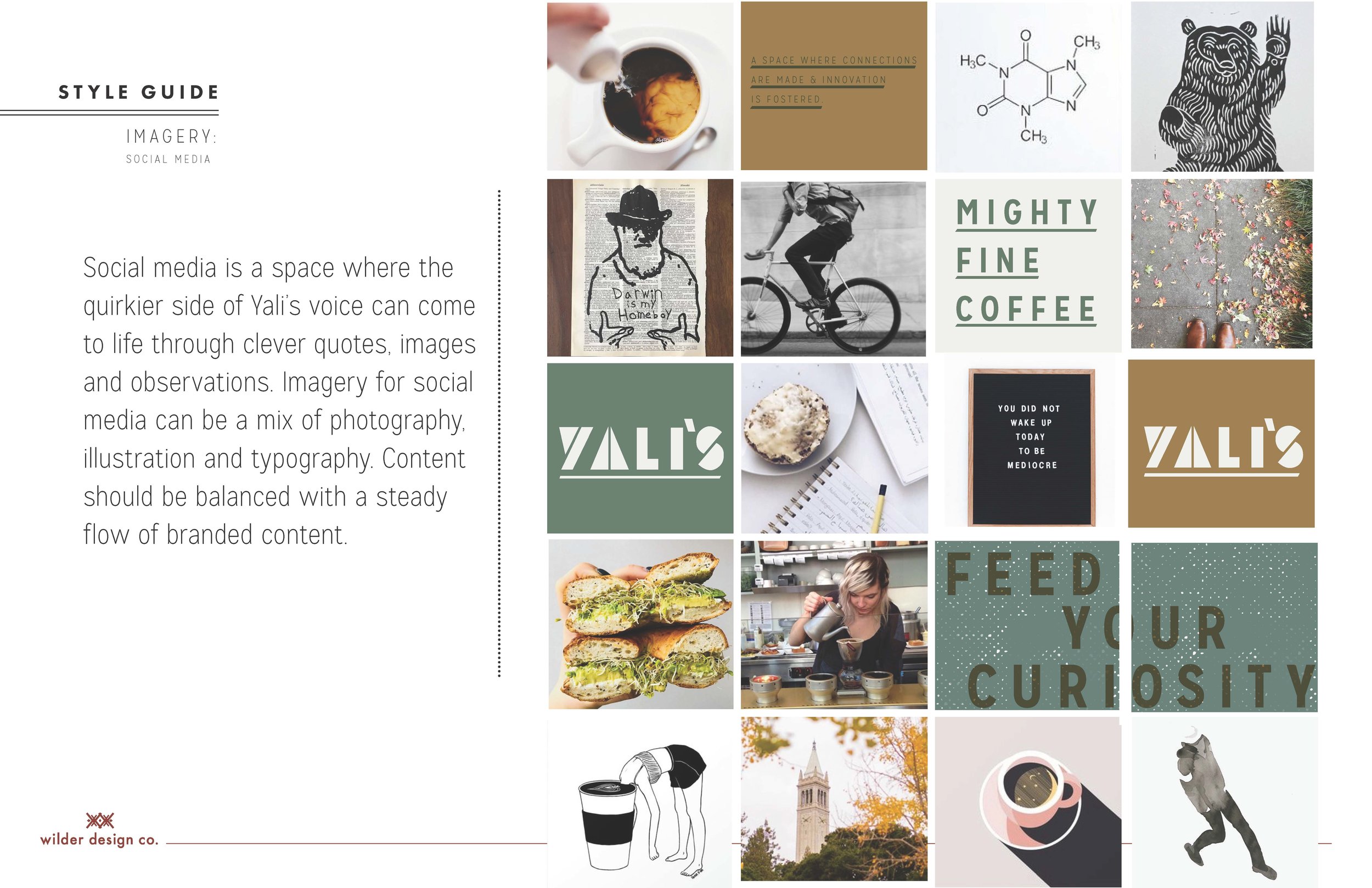
Once we had the logo mark solidified, we dove right into art direction and developing a style guide. A lot of these ideas carried over into the design of the cafe (which I'll share in another post).
There you have it - the branding process from beginning to end! What do you think - would you have chosen a different logo? ;) Let us know if you'd like to see more process posts. We have another one planned about the interiors we worked on for Yalis' - and just reach out if you'd like to learn more about any of our other projects! We're an open book.
And to wrap things up, here are a few teaser videos for Yali's Coffee we made for Instagram. Cheers!
xo, jojo